Home Blog Website Design Services An Overview of Bootstrap Framework
An Overview of Bootstrap Framework
- 19 May / 2016
- 5,862 views
The Web nowadays, is not something that can only be seen on desktops, rather we now carry it in our pockets. This is now a global trend, which is sure to grow in the time to come. So, the odds are that many people may have not seen the desktop version of certain websites, as they access the web only through their smartphones. Hence, to cover all potential consumers, a website needs to be scalable across varying screen sizes for the best experience, both through looks and functions. Further, the content needs to be trimmed down to its most vital elements.
With desktop versions already existing, the main area of concern was what is to be trimmed and what is to be slid down. Two approaches available – one was to build a responsive website design targeting specific devices and viewport sizes; whereas, the second being starting out with a design for the mobile first, with gradual enhancements for larger platforms with fewer constraints.
Bootstrap Framework
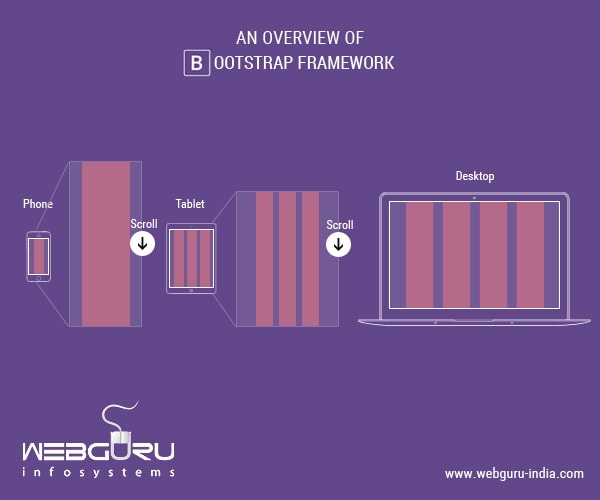
The Bootstrap framework provides an easy way of crafting website designs and allows website design services to create greatly optimized mobile designs. It efficiently scales up the website and applications with a single code base. Bootstrap includes a responsive, mobile first fluid grid system that appropriately scales up to 12 columns with an increase in viewport sizes. This Grid System is used for creating page layouts with the help of rows and columns. In simple terms, the content in bootstrap can be divided into a maximum of 12 columns. Then, depending on the device accessing the site, the content is condensed down to 6, 4, 3 or less. This also works in portrait/landscape/orientation of the devices. Here, the app detects the pixel size of the accessing device and adjusts the columns accordingly.
Mobile-first Approach
With a mobile-first approach at its core, the Bootstrap grid system builds mobile first, responsive websites, for small screens and then scales up the designs from there for the devices with larger display screen. It uses a mix of HTML5 markup, compiled and minified CSS Styling and JavaScript. With Bootstrap, one can create transition effects, drop-down menus, cover pages, image galleries, dashboards, sticky footers, progress bars, buttons, pagination and the ScrollSpy plugin. Its template designs include features like tables, forms, navigation styles, typography and more. To use JavaScript add-ons with Bootstrap, it is sufficient to refer to the jQuery library in the HTML. It also has its own jQuery plugins that can be individually used and compiled. Furthermore, BootstrapWP, is a downloadable version of the framework which can be used for designing WordPress sites.
Using Bootstrap does not mean your website needs to look like Bootstrap. Top website development companies can customize the designs to an ultimate level using innovative techniques and color illusions that can make your design stand different from generic looking designs. Bootstrap lets developers design front-ends with little knowledge of HTML or CSS. Hence, Bootstrap is extremely flexible whether it is being applied to static HTML, custom PHP-coded site or a CMS.
Conclusion
Bootstrap has finally turned out to be the trendiest front-end design framework. The main reason for its success is the huge number of resources accessible through it. It holds a very big online community and help is easily available. It is always kept updated and is presently available in GitHub for download.

5 comments
Leave a Reply

-
1000+
Happy
Clients -
25+
Countries
Served -
19+
Years of
Trust
I need help with...


Thanks for the post, It is true bootstrap framework is very essential for responsive websites. As today people use more pocket devices than desktop therefore the website should be responsive that is user friendly and optimized. Thus bootstrap is a good solution for developing mobile friendly sites and easily available framework.
Thank you for sharing this overview of Bootstrap Framework. Its very informative.
It is very much true that bootstrap framework is important for responsiveness. This post is very informative for the web design and development.
Not many people know well about bootstrap framework but this article clearly defines what it is. This technology is immensely helpful for developing mobile friendly websites. Thanks to the writer for writing such a simple to comprehend article.
I love your opinion about the Bootstrap framework. It has now become the trendiest front-end design frameworks out there. Certainly, one main reason for its success is due to its large number of resources accessible through it. Bootstrap holds a huge online community and thus help becomes easily accessible. Love your content, WebGuru-India. Looking forward to more.