Home Blog Category: Website Design Services
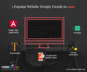
5 Popular Website Design Trends In 2017
Trends, an outcome of constant analysis and heavy research are often the most integral part of the process that takes a company forward. A Website,
- 19 Jun / 2017
- 5,853 views

Industry Standards of Hiring an Outsourced Website Design Company
Hiring an outsourced website design company to build your business website can be daunting task. Here is our best guide to look out for established
- 05 Jan / 2017
- 2,694 views

Top 10 Tips to Create a Mobile-Friendly Website
As of June 2022, the number of smartphone users across the world clocks in at around 6.65 billion meaning roughly 83.7% of the world’s population.
- 23 Dec / 2016
- 4,514 views
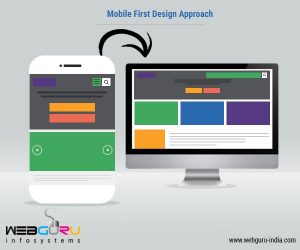
Taking a Reverse Approach to Design with Mobile-first Strategy
If you are of the opinion that mobile is the future, you are living under a rock. This notion was valid until about, say, 8
- 05 Dec / 2016
- 3,542 views

The Need of a Website for Small Businesses
In today’s world, people turn to Google for the smallest of requirements. A single search query can generate a list of innumerable websites. So if
- 23 Nov / 2016
- 4,541 views
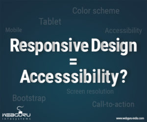
Responsive Website Design and Accessibility – Are They Related?
Websites serve as a viable source of information in today’s world. Imagine a world where you visit a website but do not get the information
- 07 Nov / 2016
- 3,170 views
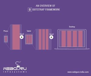
An Overview of Bootstrap Framework
The Web nowadays, is not something that can only be seen on desktops, rather we now carry it in our pockets. This is now a
- 19 May / 2016
- 5,864 views
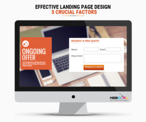
Effective Landing Page Design – 5 Crucial Factors
A landing page is also termed as “lead capture page” in the extensive arena of internet marketing as it helps capture a new lead or
- 18 Mar / 2016
- 3,154 views
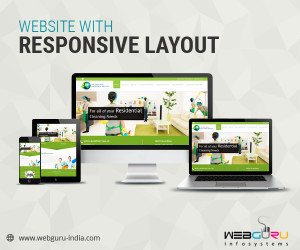
Reasons Why Your Business Requires Website with Responsive Layouts
Every business requires a website for ensuring its progress and resultant success. But, today it is not just about looking good on the monitor of
- 03 Feb / 2016
- 3,206 views
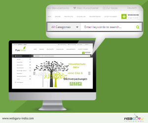
The Importance of Search Functionality in Website Design
Easily navigable pages, seamless user experience on cross devices, engaging and informative content, stunning visuals – these are some of the must-haves for a successful
- 14 Jan / 2016
- 28,331 views

-
1000+
Happy
Clients -
25+
Countries
Served -
19+
Years of
Trust
I need help with...


