Home Blog Website Design Services Navigation Menu Design Trend: Explore Its True Color
Navigation Menu Design Trend: Explore Its True Color
- 15 Jul / 2010
- 2,535 views
An impressive interface and a good navigation can transform an ordinary website into something extraordinary. To increase visitor retention, you need to give reasons to your visitors so that they can stick to your website for quite a long time and this can only be done by allowing them to explore more about your website design. Just having a good interface may not prove highly effective in the long run if the navigation of your website is average. It should not be overtly complex but you should not make it look repetitive and lackluster. You can follow the rules but that does not mean that you have to make it look boring to the end. Here in this article, we are going to explore different variation of navigation menus that will give you a quick look at ongoing trend that dominates in this sphere:
Make It Look Mac: Though this trend is slowing losing its fizz, it is still favored and adored by a large number of website designers who still count this style as cool. It is one of those few Web 2.0 concepts that have managed to survive unscathed despite the onslaught of Web 3.0. What is all the more interesting about Mac Style navigation menu is that it is still being widely employed in a large number of websites and even in those websites which have nothing with Apple. However, the reasons are quite simple. Mac Style looks good, trendy and cool. However, before applying this style in your website, you need to make sure that it does not look out of the box.
Icons In Used: – Use of icons in navigation is highly popular in designing cycle since it serves two purposes. First, it helps users to come to term with the website by casting a casual look and secondly it helps to arrest the attention of the users. However, the icons have to be placed judiciously. It should be ensured that the icons are conveying the message clearly and they are recognizable.
![]() Vertical Navigation: – Though the use of vertical navigation is largely limited to creative field, it is being liked widely as it gives a website a different look and structure. If it can be employed properly, it can yield an effective outcome at the end. However, before you use this navigation menu, you need to make sure that it is compatible with the layout of your website.
Vertical Navigation: – Though the use of vertical navigation is largely limited to creative field, it is being liked widely as it gives a website a different look and structure. If it can be employed properly, it can yield an effective outcome at the end. However, before you use this navigation menu, you need to make sure that it is compatible with the layout of your website.

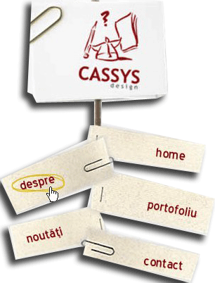
Hand Written Menu: – Hand written style is the most talked about trend that is making a buzz in the designing circle lately. It may look great but if you are running a corporate website, you should debar yourself from taking such drastic decision.

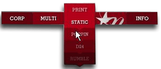
Experimental solutions: – An increasing number of website designers are making experiments with the navigation of their website and this is what has opened up a floodgate of opportunities for those who are passionate about designing something different. However, you should keep your creative impulse in check and try to do something that makes sense. Here are examples that you can try:


-
1000+
Happy
Clients -
25+
Countries
Served -
19+
Years of
Trust


