Home Blog
How Healthcare Applications Improve Patient Engagement
- 03 Jun / 2026
- 100 views
- 9 Min Read
The shift toward patient-centric digital care is no longer a futuristic trend; it is a current necessity. Healthcare applications act as a vital bridge, empowering patients to manage their well-being actively while allowing providers to deliver seamless, continuous care outside the clinic walls. From automated medication reminders to real-time vitals
Continue Reading
What to Look for in an e-commerce Development Partner
Selecting the right digital ally requires looking beyond beautiful frontend templates. A top-tier e-commerce website development company must demonstrate strict mastery over database scalability, mobile-responsive
- 30 May / 2026
- 156 views
- 9 Min Read

Why Heatmaps Are The Easiest Way to Improve Your Website
Traditional analytics can tell you when a visitor leaves your website, but they completely fail to explain why. Website heatmaps bridge this critical data gap
- 25 May / 2026
- 137 views
- 9 Min Read
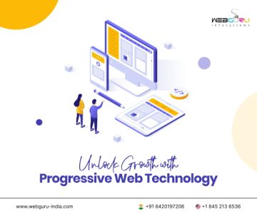
What Are Progressive Web Apps and Are They Right for You?
Progressive Web Apps (PWAs) represent a massive shift in how businesses connect with mobile users. By leveraging modern web capabilities, PWAs provide an app-like experience
- 11 May / 2026
- 162 views
- 9 Min Read

6 B2B E-commerce Features to Enhance Your Digital Presence in 2026
In the competitive landscape of digital trade, a standard retail setup isn’t enough. Many wholesalers struggle because their platforms lack specific B2B logic. By partnering
- 28 Apr / 2026
- 282 views
- 9 Min Read

How to Build a Content Strategy That Actually Drives Leads
Creating content without a strategy is just noise. To truly grow, businesses must leverage professional digital marketing services that prioritize lead generation over vanity metrics.
- 23 Apr / 2026
- 261 views
- 8 Min Read

One-Page vs. Multi-Page Website: What’s Right for You?
Choosing between a one-page and a multi-page website is a pivotal decision for any brand. As a premier website development company, Webguru Infosystems understands that
- 17 Apr / 2026
- 253 views
- 9 Min Read

How to Validate a Mobile App Idea Before You Build It
Launching a successful application is more than just a great idea. It requires market proof. Before investing your capital, it is crucial to leverage professional
- 07 Apr / 2026
- 378 views
- 8 Min Read
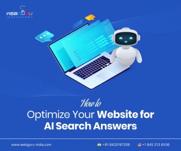
How to Optimize Your Website for AI Search Answers
AI-powered search is no longer a future trend — it’s today’s reality. Tools like Google AI Overviews and ChatGPT Search now answer queries directly, reshaping
- 26 Mar / 2026
- 377 views
- 9 Min Read

Offline-First Apps: Why They Are Winning in Emerging Markets
Offline-first apps are designed to function without an active internet connection, syncing data in the background once connectivity is restored. In emerging markets like India,
- 24 Mar / 2026
- 646 views
- 9 Min Read

-
1000+
Happy
Clients -
25+
Countries
Served -
20+
Years of
Trust
I need help with...


