Home Blog Category: Website Design Services

6 Reasons Maximalist Typography Is Making a Big Return
Digital design has shifted toward maximalist typography—bold, oversized type that commands attention and drives conversions. A skilled website design company understands how to implement large-scale
- 12 Jan / 2026
- 541 views
- 9 Min Read

Web Design Revolution: The Must-Watch Trends of 2025
Web design in 2025 is expected to redefine digital landscapes through trends that combine creativity, innovation, and responsibility. From unorthodox layouts and immersive 3D designs
- 04 Jan / 2025
- 8,013 views
- 9 Min Read
Why the World Trusts India for Web Design Outsourcing
India is revolutionizing website design services through incredible talent and innovative solutions. Indian web designing companies blend the best elements of creativity, technical skills, and
- 16 Dec / 2024
- 2,183 views
- 8 Min Read

Explore the Most Impactful Website Design Trends Now
Web design has seen a rapid transformation in the trends over the years as population preferences and technology evolved. 2024 has seen numerous minor and
- 11 Sep / 2024
- 2,590 views
- 8 Min Read
Importance of Consistent Branding for Small Business & Tips to Ace It
You are missing out on a lot if you are not focusing on consistent branding! The reason your business does not have an exclusive identity
- 13 Aug / 2024
- 2,891 views
- 8 Min Read

10 Best Practices for Designing a Small Business Website
Whether you are a seasoned entrepreneur or a budding brand, a user-friendly and functional website is your 24/7 storefront, constantly welcoming potential customers and showcasing
- 07 Jun / 2024
- 2,775 views
- 8 Min Read
Top Designs to Take Your Website’s Online Presence to the Next Level
Online presence is of paramount importance for a business nowadays. For any business across the world, its website serves as the virtual storefront. With the
- 29 Feb / 2024
- 3,377 views
- 7 Min Read
Uncovering the Psychology of User Experience for Web Design
The prominence of website design services has grown quite a bit in the constantly-changing online world, where data moves like a river and attention spans
- 28 Sep / 2023
- 3,326 views
- 6 Min Read
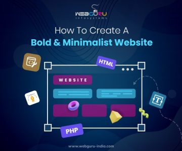
How Businesses Can Benefit from a Minimalist Web Design
Creating an impactful website should be one of the top priorities of any business that wants to dominate competitors online. However, there are also demands
- 25 Sep / 2023
- 6,988 views
- 7 Min Read

How to Use Interactive Design to Increase User Engagement
Interactive design is an important part of user experience (UX) design that focuses on generating compelling and accessible digital experiences for visitors. It entails creating
- 18 Sep / 2023
- 10,184 views
- 7 Min Read

-
1000+
Happy
Clients -
25+
Countries
Served -
20+
Years of
Trust
I need help with...


