Home Blog Website Design Services The Importance of Color Theory in Website Design
The Importance of Color Theory in Website Design
- 27 Nov / 2015
- 9,208 views
A website describes your business personality. It symbolizes your business. There is more to website design in addition to text and images – color. Colors make a website expressive. Each color has a meaning and an ability to trigger our psychological senses. Website design companies around the world appreciate its important role in marketing and branding. It influences the likability of a brand and its perceptions.
Understanding colors
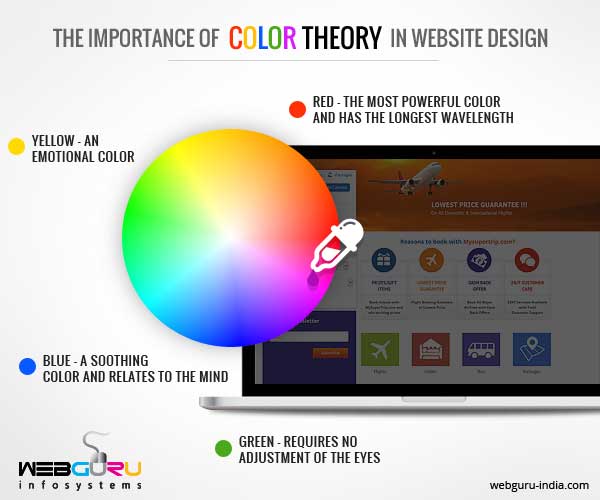
There are four primary colors. Red, Yellow, Blue and Green. Red relates to body, yellow to emotions, blue relates to the mind while green relates to the balance between body, mind and emotions.
Let us understand the psychology of the colors mostly used.
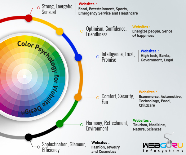
- Red – It is the most powerful color and has the longest wavelength. It grabs the first attention. It is strong, energetic, sensual, stimulating and courageous. At the same time, it also symbolizes danger, aggression and demand.
- Blue – Blue is a soothing color and relates to the mind. We react to it mentally. It stimulates transparency and aids in concentration. The positive reflection of blue can be seen in intelligence, trust, promise, efficiency, duty, logic and communication. Negatively, blue symbolizes coldness, unemotional and unfriendly.
- Green – Green requires no adjustment of the eyes. Green is restful. Also, it occurs in the center of the spectrum and hence is the color of balance. Positively, it symbolizes harmony, refreshment, rest, environment and peace. Negatively, it represents stagnation, boredom and fatigue.
- Yellow – It is an emotional color. It can be said to be the happiest color. It has a long wavelength and hence it is stimulating. Yellow lifts our spirits, gives us confidence and instills optimism. Too much yellow however, has a reverse effect and confuses the perceiver. The positive effects of yellow are optimism, confidence, friendliness, happiness and self esteem. Negative influences of yellow are fear, depression, anxiety and fragility.
- Orange – It is a secondary color, a combination of red and yellow. Hence, it stimulates both physically and emotionally. It focuses on food and warmth. Too much orange shows lack of seriousness. The positive influences of orange are comfort, security, fun and warmth, while its negative influences are frustration and immaturity.
- White – White is a total reflection. It reflects the entire spectrum. It signifies hygiene, clarity, purity, peace, simplicity and efficiency. Negatively, it signifies coldness, sadness and unfriendliness.
- Black – Black is total absorption. It has considerable psychological implications. It is a color of sophistication and goes very well with white. Black signifies sophistication, glamour, efficiency and substance. It can also be considered as a negative color. It signifies oppression, coldness, selfishness and heaviness.
- Gray – This color is said to have no psychological properties of its own. It is a color of hibernation and has a dampening, gloomy effect.
Factors Behind Appropriately Using Colors
Now that we understand the psychological properties of most of the standard colors, let us review the factors to consider for using them appropriately.
- Review the product being sold: Environmental websites, fresh products call for green, bank and corporate websites call for blue, jewelry websites call for sophisticated black, and food related websites call for red or orange. Hence the color chosen should be based on the type of products that are sold. Usually the look and feel of a website is based on the color combination of the logo, but that does not always work out.
- Focus on the audience: Different age groups correspond to different colors. The colors that work for kids and toddlers will not work for elderly people. Also the colors working for professionals will not attract the trendy teenagers. Hence, the color combination of a website should be also based on its target audience.
- Background color: Keeping a subtle background color keeps focus on the on the page content and boosts the main colors used.
- Black Text: It’s preferable to keep the content text in black as people are used to that. This also depends on the size of the text used. Use the best of your analytical mind for the appropriate text shade. The content should stand out and invite people to read it. The content should not get lost in the combination of colors used. For instance, a dark gray text on a light gray background will just absorb the text and people will need to put an extra effort to read them. Black text, white background works best for content related websites.
- Do not overuse colors: The use of colors should be relevant to the products, the audience and the sophistication and clarity aspired for.
Conclusion
Choosing colors for a website is not about your color preferences. Colors working well individually may not work well in combinations. The correct color combination for a website can be achieved by experimenting with color combinations as well as their individual symbolism. Hence, color is a powerful tool for your website. Just like websites, the significance of colors in logos and marketing is equally noteworthy. If colors are properly used, they can accentuate your brand identity. Every color can tell a story.

15 comments
Leave a Reply

-
1000+
Happy
Clients -
25+
Countries
Served -
19+
Years of
Trust
I need help with...


The website design is mostly dependent on color psychology. The information here will help a lot of web designers.
Wonderful Article! When you are making a corporate website design, you need to follow some basic guidelines. Without these, your website will just be a burden than being an asset to your business, so all the aspects of website designing are very important.
This is a very useful information thanks to provide this valuable post,,…
I really didn’t know the importance of colors in websites. While reading this article, I realized that every single word here is right, even I get the feelings mentioned here when I look into a website.
Thanks for sharing this with us………….very nice post
Exactly WebGuru! Colors played an important role in placing the impression of website on the customer and also you have explain it fantastically. Great work done by you.
Very nice and informative sharing.A good color contrast is very
important aspect in web designing.The colors we use,the amount and types of
content we display,can have a big impact on what our viewers see and do.Thanks
for the post.
@Saurabh Sawla, Yes you are right. Thanks for liking the article.
@Peter Witer, Thanks. Stay tuned for more interesting write-ups.
@Charles Mahone, Absolutely. Not just the websites; but logos, newsletters, flyers and other promotional items can be made attractive by proper usage of colors.
@Guest, Glad you liked it.
Colors really do make a big difference. Thanks for the insightful blog into coloring and how to make web designs that are both harmonious and clean. It is interesting because coloring really can deliver these abstract qualities of perfection and vibrancy to anyone who sees those images.
@Jiya Thakkar, Thank you for your comment. Glad you liked it.
Color psychology is a very interesting topic. Good to see how it is being used in the website designing concept.
nice one