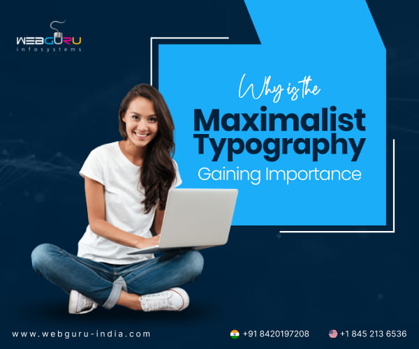
Home Blog Website Design Services 6 Reasons Maximalist Typography Is Making a Big Return
6 Reasons Maximalist Typography Is Making a Big Return
- 12 Jan / 2026
- 604 views
- 9 Min Read
Digital design has shifted toward maximalist typography—bold, oversized type that commands attention and drives conversions. A skilled website design company understands how to implement large-scale headlines that work across devices without sacrificing speed. This approach solves critical problems: capturing attention in crowded feeds, creating memorable brand identity, and improving mobile readability. When done right, maximalist typography reduces reliance on heavy graphics, speeds page loads, and guides users through clear information hierarchies.
Typography has gone loud. Across websites and apps, headlines are growing bigger. The letters are bolder. Text treatments are more theatrical. The effect is unmistakable. When a user lands on a page, a single oversized word can stop the scroll. Maximalist typography simply means using type as the main visual.
Minimalism has worked for years. Brands want to be heard. Big type scans fast, sticks in memory, and cuts through feeds. If you work with a website design company, this trend changes briefings and project priorities. Teams must pick type, layout, and technical strategies that keep load times short while making a bold visual statement.
Maximalist typography is not a fad. When done right, it improves user attention, tightens brand identity, and lifts conversions. A trusted e-commerce website development company can help you with this.
Understanding the Maximalist Typography Renaissance
Maximalist typography is a careful rethink. It is visual noise used with intent. At its heart, maximalist typography uses large-scale text, experimental fonts, layered and overlapping type with bold colour contrasts. Designers pair custom letterforms with oversized weights. They break the grid. They use kerning, tracking, and line-height aggressively. The result reads like a visual headline.
Oversized text cuts through the clutter. With short attention bursts, a headline must work fast. People scan more than they read. Mobile drives most web traffic, so clear, large type works better on phones.
The 2010s favoured minimal micro-interactions. By the 2020s, hero sections and expressive fonts rose. Now deliberate excess in type is back. Luxury and tech brands use it to stand out. E-commerce and apps use it for promotions and onboarding.
Businesses are reconsidering their design approach when partnering with an e-commerce website development company. When you brief them, they balance drama with performance. Big type can lift conversions if it loads cleanly.
6 Compelling Reasons Maximalist Typography Is Dominating Digital Design
There are several reasons why companies are choosing to go with minimalist typography. This change solves practical problems. Each reason ties to attention, identity, speed, clarity, cost or shareability. Here are six reasons product, marketing, and design teams choose bold type today.
1. Instant Visual Impact and Improved User Attention
First impressions form fast. Type can make them count. Large headlines form a clear focal point. A single oversized line can define the page and curb aimless scrolling. For e-commerce, a strong headline lowers bounce rates and drives clicks to CTAs.
A mobile app development company can leverage this for app onboarding and key action prompts. App teams can use large, clear type in onboarding and prompts to reduce friction.
2. Enhanced Brand Personality and Memorable Identity
Type is a brand voice in visual form. It is a powerful brand differentiator. Fonts convey tone. Slab serifs read trustworthy, Grotesques feel modern, and custom display fonts feel unique. Big type makes the tone unmistakable.
Bold type can express confidence, luxury, friendliness, or edge. The right weight, spacing, and colour anchor a brand message. For crowded categories, typographic recall can be the difference between a click and a scroll.
3. Superior Mobile Responsiveness and Readability
Mobile-first design is no longer optional. According to Statista, mobile devices accounted for 62.54% of global website traffic in Q2 2025. But phones give less readable surface. Large typography naturally adapts to smaller screens. They scale down predictably when you define responsive type scales.
Large type helps users with vision issues and those on the move. It speeds comprehension. Mobile app development companies prioritise readability in interface design. Developers must ensure fonts render clearly, and tap targets remain usable.
4. Clearer Information Hierarchy and Guided User Journey
Bold type structures content at a glance. Oversized headlines point users to priorities and let secondary content recede. On product pages, checkout, or onboarding, a good hierarchy shows the path and next steps.
Maximalist typography also makes key information immediately visible. This reduces cognitive load. When key text is visible, users process less. This lowers friction and lifts conversions.
It also helps with conversion optimisation for e-commerce platforms. The right headline nudges users toward product details and the buy action. E-commerce teams set type scales, responsive rules, and semantic markup so content stays clear.
5. Reduced Dependency on Heavy Graphics and Faster Load Times
Text can replace images and video as the primary visual. You can also use maximalist topography as visual content. When type carries visual weight, sites need fewer large images and videos. Fewer large media files mean faster loads. Fast pages keep users and rank better.
Faster pages also improve Core Web Vitals and search visibility. Font loading strategies prevent layout shifts and speed first paint. It is also cost-effective. Less media hosting and bandwidth lowers costs, especially for global audiences. Apps and sites both run faster with lighter assets and optimised fonts.
6. Social Media Shareability and Marketing Amplification
Bold typography performs well on social feeds. Text-first visuals make clean, scannable social cards that load fast. High-contrast typographic posts do well on Instagram, LinkedIn and Pinterest and often get reshared.
A sharp typographic quote or sale headline can stop a thumb. Use the same type system on site, app, ads, and social to build a single visual voice. These also provide integration opportunities for businesses working with digital marketing teams. Design templates and export settings make campaigns faster to run and easier to test.
Typography Meets Technology: Implementation Considerations
Maximalist typography needs careful build work. The main risks are performance, inconsistent rendering and accessibility. Here are some points to consider before you start implementing them.
- Technical Aspects: Use responsive type scales and fluid techniques. Limit fonts and weights. Subset and preload critical fonts and use font-display to avoid invisible text.
- Importance of Working with Experienced Developers: Experienced developers know that font loading and accessible markup matter.
- Responsive Design Requirements: Test across devices and rendering engines. Native apps and webviews vary.
- Font Loading Optimisation for Performance: Optimise fonts. Use WOFF2 or self-host. Preload only what’s needed.
- Accessibility Considerations: Keep high contrast, sensible line height, and scalable text. Use semantic HTML and avoid decorative fonts for long copy.
Professional website design company teams include font strategies. They balance aesthetics with Core Web Vitals and app store rules. The typography must not break the flow. Design and engineering should share a checklist:
- Font choices
- Load plan
- Fallbacks
- Accessibility checks and templates
Practical Steps to Adopt the Maximalist Type
Start small. Test a single headline on a landing page. Track bounce and click-through rates. Compare variants in short A/B tests. Use analytics to measure dwell time and CTA clicks. Begin by setting up a simple typographic system.
- Set a Simple Typographic system: Pick one display face for headlines. Choose one neutral face for body copy. Limit weights to two or three.
- Plan Fallbacks and Scales: Define font stacks that fall back to system fonts when a custom font fails. Create a responsive scale: H1, H2, H3 sizes that map to viewport widths.
- Respect Rhythm: Large type needs breathing room. Increase line-height for readability. Keep paragraphs short. Use subheads and pull quotes to break long pages.
- Design for Marketing: Build a social template system for typographic posts. Save export settings for common image sizes. Keep the visual voice consistent between site, app, and ads.
Make Your Brand Unmissable with Maximalist Typography
Maximalist typography answers real problems: attention, identity, clarity, speed and shareability. Brands that use this typography thoughtfully stand out and leave stronger impressions.
Audit your home page and onboarding. Find where type can carry the message. Partner with an experienced ecommerce website development company or mobile app development company to redesign with bold, conversion-focused typography. Working with a proven website design company makes the process safer.
Webguru Infosystems builds striking, high-performance sites and apps. Our teams make maximalist typography work without slowing pages. If you are still confused, run a quick audit on your landing pages. Contact us at enquiry@webguru-india.com to get started.

Srishti Bhattacharyya
A writer driven by a love for words, who is constantly exploring new ways to push the boundaries of expression. Always testing the limits of creativity, she finds inspiration in books, painting, and the endless ideas waiting on Pinterest.

-
1000+
Happy
Clients -
25+
Countries
Served -
20+
Years of
Trust
I need help with...


