Home Blog Website Development Mastering White Space: The Ultimate Guide to a High-Converting Web Design
Mastering White Space: The Ultimate Guide to a High-Converting Web Design
- 12 Aug / 2026
- 264 views
- 8 Min Read
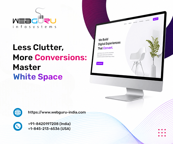
Many brands fall into the “clutter trap,” cramming every pixel with text and features out of fear of leaving money on the table. However, overcrowding your layout triggers cognitive fatigue, causing high-intent visitors to bounce. Strategic white space is not passive, empty real estate. It is an active conversion engine. By engineering clean spatial layouts, an experienced website development company reduces decision paralysis, establishes immediate brand authority, and isolates your high-value call-to-action buttons. Embracing negative space transforms your website from an overwhelming data dump into an intuitive, persuasive digital journey that quietly guides prospects straight towards conversion.
Here’s a trap a lot of brands fall into: they think every empty pixel on a page is wasted real estate. So they cram in more text, more banners, more buttons — because surely, more visibility means more sales.
It doesn’t. It usually means the opposite.
A seasoned website development company will tell you that white space isn’t empty at all. It’s an active structural layout tool — one that shapes how visitors read, feel, and act on your site. Used well, it doesn’t waste space. It directs attention.
That’s the core idea behind this guide. White space reduces cognitive overload and drives user actions. Get the spacing right, and you’re not just making a page look cleaner; you’re building a path that leads visitors straight to conversion.
The Psychology Behind Negative Space and User Persuasion
Easing Cognitive Overload for High-Intent Visitors
Every extra element on a page is a tiny decision your visitor has to make.
Every ‘read this’, ‘skip that?’ and ‘click here’ scattered along your cluttered page is more prone to giving your visitors decision fatigue. They disengage before they ever reach your offer.
White space slows that process down in a good way. It gives the eye (and the brain) room to breathe between decisions, which keeps visitors calmer and more receptive to your message.
This isn’t just a design opinion — the numbers back it up. According to Forrester Research, a friction-free, well-thought-out user experience design can raise a website’s conversion rates by as much as 400%. Spacing is one of the simplest, highest-leverage ways to remove that friction.
Think about the last cluttered site you left within seconds. Chances are it wasn’t bad content that drove you away. It was the feeling of not knowing where to look first. That split-second hesitation is enough to lose a visitor for good, which is exactly why easing cognitive load matters so much before a single word of copy even gets read.
Guiding the Eyes via Spatial Hierarchy
Spacing doesn’t just declutter — it creates a path. Generous gaps around headlines pull the eye toward them first. Tighter spacing within a paragraph signals “read me together.” Your layout becomes a set of visual signposts, quietly telling visitors where to look next without a single word of instruction.
Notice how luxury brands rarely fill their pages edge to edge? This is deliberate. Generous padding signals confidence — a brand that doesn’t need to shout to be noticed. Enterprise buyers pick up on that instinctively. Tight, cramped layouts read as budget; open, breathable ones read as premium.
Explore how businesses can benefit from a minimalist web design.
The Mechanics of White Space: Macro vs. Micro Space
Macro White Space (The Global Layout Structure)
This is the big-picture spacing: margins around the page, gaps between major sections, the breathing room between your hero banner and your feature grid. Macro space sets the overall rhythm of a page — it’s what makes a layout feel organised instead of stacked on top of itself.
Micro White Space (The Fine-Tuning Elements)
Micro space is smaller but just as important:
- Line spacing (leading) — the gap between lines of text, which affects how easily paragraphs are scanned
- Kerning — the space between individual characters, which impacts readability at a glance
- Padding around copy blocks — the cushion that keeps text from feeling boxed in
These details rarely get noticed consciously, but they’re a huge factor in reading endurance — how long a visitor is willing to keep scrolling and reading before they give up. Get the leading too tight, and paragraphs start to blur together. Get it too loose, and text feels disconnected. The sweet spot is almost always somewhere a designer has to test, not guess.
Together, macro and micro spacing work like a set of nested containers — the big structure sets the mood, and the small details determine whether visitors actually stick around long enough to read what’s inside it.
Bridge the Gap: Turning Design Elements into Conversion Tools
The “Isolation Effect” for Call-to-Action (CTA) Optimisation
Want a button to get clicked? Give it room. Surrounding a CTA with negative space isolates it from competing elements so it’s the first thing the eye lands on. This is called the isolation effect, and it’s one of the simplest conversion levers in web design — no copy changes required, just space.
Balancing Content Density with Visual Breathing Room
Not every page can be sparse. Product grids, pricing tables, and data-heavy sections need to show a lot of information. The trick is consistent spacing between repeated elements. Uniform gaps between product cards or table rows keep dense layouts organised rather than claustrophobic. This allows visitors to scan without feeling overwhelmed.
This is where a lot of teams overcorrect. Fearing a “busy” look, they shrink spacing everywhere and end up with a page that feels cramped instead of clean. The better approach is selective: tighten spacing within related groups of information, then widen it between groups. The contrast is what actually creates order. Not spacing applied evenly across the whole page.
Seamless Execution: From Visionary Aesthetics to Responsive Code
Why Modern Layouts Require Elite Website Development Services
A spacing strategy that looks great on desktop can collapse into chaos on mobile if it isn’t built correctly. This is where design vision has to meet solid engineering.
Skilled website development services use tools like CSS Grid and Flexbox to make spacing responsive — margins and gaps that scale intelligently across screen sizes instead of just shrinking everything uniformly. That’s the difference between a layout that adapts gracefully and one that turns into a cramped mess on a phone.
Reliable website development services also test spacing across real devices, not just design mockups, because what looks balanced on a 27-inch monitor can feel suffocating on a 6-inch screen.
Mitigating the Common Pitfalls of Careless Spacing
Spacing mistakes are easy to make and costly to leave uncorrected. Watch for:
- False bottoms — accidental gaps large enough to trick visitors into thinking the page has ended, causing them to leave before reaching key content below
- Inconsistent rhythm — spacing that varies randomly between sections, which makes a page feel unplanned
- Orphaned elements — buttons or text floating with no clear relationship to nearby content.
Careful website development services catch these issues before launch, not after conversion rates start slipping. It is one of the major reasons why choosing a professional website development company makes the most sense.
Ready to Elevate Your Digital Experience? Partner with Webguru Infosystems Today
White space was never empty. It’s an engineered conversion strategy — one that eases cognitive load, guides the eye, builds trust, and gives your CTAs room to do their job.
But getting the balance right takes more than good instincts. It takes a website development company that understands both the psychology of design and the technical execution behind it.
If your site feels cluttered, or your conversions have plateaued, it might be time for a closer look at how your pages breathe. Ready to see what better spacing could do for your conversions? Get a professional design audit or request a project quotation from Webguru Infosystems today.

Srishti Bhattacharyya
A writer driven by a love for words, who is constantly exploring new ways to push the boundaries of expression. Always testing the limits of creativity, she finds inspiration in books, painting, and the endless ideas waiting on Pinterest.

-
1000+
Happy
Clients -
25+
Countries
Served -
20+
Years of
Trust
I need help with...