Home Blog Website Design Services Innovative Web design Techniques for Mobile Devices
Innovative Web design Techniques for Mobile Devices
- 28 Feb / 2014
- 3,720 views
At one point in time creation of mobile web design with feel and look of native apps had been a distant dream. However, the latest developments and innovations have paved an easy way for well-designed apps. The main aim of these techniques are to make sure that the websites are adaptive and provide great user experience, no matter what the screen size. Different device capabilities are also targeted through the website designs which has made some mobile designs that are quiet advanced work really well on the latest devices. Here are some web design patterns and techniques which are truly innovative.
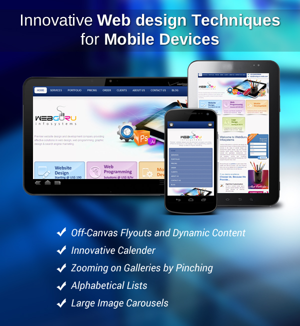
Off-Canvas Flyouts and Dynamic Content– The page areas which lives out of view unless swiped or tapped on by a user is called off-canvas flyouts. Mobile-based web apps have made their main navigation pattern and even some desktop websites flaunt this as well. Off-canvas flyouts are often used by major web pages to hide menus and some other content that is static. But it can also be used for display of lots of dynamic content as well. In fact both dynamic and static content may be placed there. You hide primary navigation within off-canvas menu located on the right with the header’s left containing secondary flyout that reveals the recent history of the user on that site. This feature may turn out to be doubly beneficial for those sites which are content-heavy.
Innovative Calender– Calenders that are web-based on mobile devices are generally rigged with terrible experiences, leading most designers to avoid them. Normally design patterns such as dates simply listed are preferred. But if you use JavaScript and carousels then mobile users may be benefited by usable calenders.
Zooming on Galleries by Pinching– When we pinch to zoom texts it displays signs of content that is poorly formatted however in case of images it is quite different. Frequently users zoom in pictures as they want to observe the details. Your image gallery of products may be progressively enhanced by this feature so that any slide can be zoomed in and the image may be viewed in finer details. However, it must be remembered that performance must be treated as design feature, so ensure that when you build complex features the devices that they are meant for can actually support them completely.
Alphabetical Lists– User experience can be greatly enhanced by allowing them to scroll through vast item lists alphabetically. For that alphabetical index is the best solution. There is some amount of this functionality in some apps like when choosing music and contacts but bringing this very functionality in web may prove to be quite difficult. However, a little bit of manipulation may help your users enjoy this feature.
Large Image Carousels– Implementation of vast image carousels may be quite painful in mobile, mainly due to navigation and performance factors. But if these can be overcome a powerful and satisfying browsing experience may be created which will aid your users to take advantage of high DP screen available out there. For the performance issue, the main problem is the size of the images which makes unloading really time-consuming and painful. So solve that, image carousels may be optimized so that the page does not contain inactive slides. Navigation may be challenging since moving low rows of images quickly may be problematic. You can solve this problem by creation of grid-like view through use of carousel HTML and changing CSS and image sources.
With devices becoming more and more powerful, web design techniques have become more sophisticated, making them more adaptive and responsive. These techniques help in creation of interesting features that make the entire user experience enjoyable.


-
1000+
Happy
Clients -
25+
Countries
Served -
20+
Years of
Trust
I need help with...


