Home Blog Website Design Services Using Color Strategically in Website Design
Using Color Strategically in Website Design
- 28 Jun / 2022
- 3,699 views
Color is a very powerful tool in website design. Attracting attention, expressing meaning, creating desire, directing conversation – all of this and more can be achieved through a smart and strategic use of color. Similar to layout and the tone of your language, the color your visitors see in your website determines how they feel about it, and whether or not they will be returning.
What Makes Color Important to website Design
Colors help increase the recognition of your brand, and also prompt visitors on your site to take action. Any judgement they make subconsciously about your brand may be based on your site’s color palette. Therefore when a website design company first sits to design your website, they first consider 2 things – the emotions your brand wishes to evoke, and the philosophies and cultural contexts it wants to align with. This is the first step to making meaningful color choices in a website design.
1. Color Psychology – colors spark emotions
Color psychology refers to the effect that colors may have on a person’s emotions, feelings, and behaviors. While the rules here are not set in stone, people are partly drawn to certain colors because of how they make them feel. Context here is very important. Red can mean fear and danger to some, and passion and excitement to others. When using color in website design, it needs to integrate seamlessly with all the other elements of the site – typography, copy, and images.
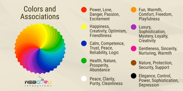
Here are some colors and their associated emotions. Once again, while not set in stone, these are general associations, and have a genuine influence on the audience. This should help you make color choices based on how you want your audience to feel, and what actions you want them to take.
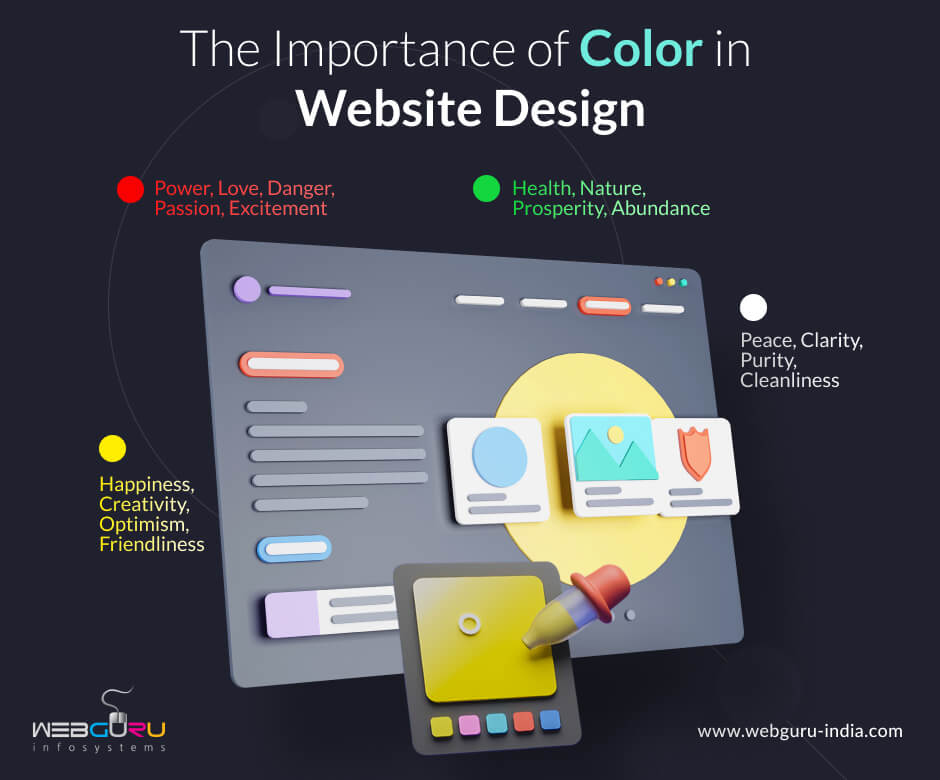
- Red: power, love, danger, passion, excitement
- Orange: fun, warmth, comfort, freedom, playfulness
- White: peace, clarity, purity, cleanliness
- Blue: calm, competence, trust, peace, reliability, logic
- Purple: luxury, sophistication, mystery, loyalty, creativity
- Pink: gentleness, sincerity, nurturing, warmth
- Green: health, nature, prosperity, abundance
- Brown: nature, protection, security, support
- Yellow: happiness, creativity, optimism, friendliness
- Black: elegance, control, power, sophistication, depression
2. Cultural Context
While different colors may have different meanings to different people, sometimes colors also come with cultural significance. In many western countries, black is associated with death and mourning, while the same color is white in many Eastern countries. Similarly, the color red is associated with attention and urgency in Western cultures, whereas many Eastern cultures associate it with luck. Context is critical to color selection. Often, you may want to choose your brand’s colors depending on the market you wish to target. Depending on where your market is based, the colors on your website may send considerable different messages.
Of course, this isn’t necessarily the case, especially when it comes to significantly large and popular brands whose images are already ingrained into our general psyche. The red of Coca Cola or KFC, for instance, will generally not bring with them any negative connotations anymore considering how popular and well known they are.
Basics of Color Theory
Color theory is a set of principles which are helpful in understanding and creating complimentary color palettes and combinations. These fundamental principles can really help you create a palette that will suit your brand’s exact needs.
– Primary Colors – These are 3 in number – red, blue, and yellow.
– Secondary Colors – These are created by mixing primary colors – green (yellow + blue), orange (yellow + red), and purple (blue + red).
– Tertiary Colors – These are combinations created by mixing primary and secondary colors.
– Tints, Shades, Tones – All the colors mentioned above are termed as “pure colors”. However, these colors can be further worked with to create additional ones. You create tints by adding white to the pure colors, making them lighter and less intense. You create shades by adding lack to them, making the colors heavier and more intense. You use both black and white in varying degrees to create tones from pure colors.
– Contrast – Contrast is the perceived difference between two colors when placed side by side. Higher the contrast, the more two colors stand out from each other. This is a very important principle, as varying levels of contrast can create a world of difference to your website. Colored text on a low contrast background may cause readability issues. Contrast can also draw attention to specific elements (or even draw attention away from specific elements if used smartly) in your web page, and make them visually stand out.
Color Models
In graphic design, colors are also described using color models. This is because there are millions of colors, and it is impossible to name all of them separately. These standards were created to let us easily describe colors using values.
– RGB Model – This is the model used when one is working with on-screen designs. RGB stands for Red, Green, and Blue. Each of these colors are assigned a value ranging from 0 to 255, and the various combinations bring us the various colors. The colors are often presented as color codes – 6-digit hexadecimal code numbers. It is an “additive” color model.
– CMYK Model – This model is used for print purposes. It stands for Cyan, Magenta, Yellow, and Black, and each color is described by its percentage of these constituent colors. It is a “subtractive” color model.
– LAB Model – LAB stands for Lightness, A Channel, and B Channel. It is a slightly more complex model. It consists of a lightness factor that ranges from 0 to 100, an A component on the green-red axis, and a B component on the blue-yellow axis. This makes the color description much closer to human approximation as compared to the RGB or CMYK models.
Creating Color Palettes
The first color that you choose for your website is the main color of your brand (Red for Coca Cola, for example). This is where color psychology becomes particularly helpful. You use the color based on the emotions and personality you wish to convey. After that, you create a color palette by choosing harmonizing colors to your base color. This is where a color wheel comes into play.
– Color Wheel – The color wheel is a tool used to show the relationship between colors. It is basically an abstract illustration that organizes various color hues in a circle.
With the help of a color wheel, there a 5 main kinds of color palettes that you can create –
– Analogous Palette – Analogous colors are placed next to each other in a color wheel. They have a low contrast with each other, and fit together well providing a subtle effect.
– Monochromatic Palette – These palettes are based on a single color that stands out, paired with elements of different shades and tints. This palette can be very pleasing to look at. However, to prevent a monotonous feel, it might be a good idea to include complimentary and even contrasting colored elements to the web page.
– Triad Palette – This palette uses 3 colors that are spaced evenly apart on the color wheel. This technique needs to be used smartly, not just to choose colors that will go well together, but also to use them in a way that doesn’t look too cluttered and noisy.
– Complementary Palette – This palette uses colors from opposite ends of the color wheel. This can be used effectively to create high contrast art styles that draw attention to specific sections of your webpage.
-Split-complementary Palette – This palette is similar to complementary palettes, but with an additional color that is placed next to one of the complementary colors on the color wheel. When used smartly, this style is effective in creating a more natural look without too much noise.
Useful Tools for Inspiration
Inspiration for new color palettes can be found everywhere, from rival websites to nature and the great outdoors. It also helps to stay updated on latest branding trends. Here are a few helpful tools that can get you started with new color ideas immediately.
– Pinterest – Pinterest holds an impressive number of color palette ideas created by various designers around the world. These can serve as a great source of inspiration.
– Pantone – Pantone is the industry leader in the field of color. It uses a physical color index that identifies all kinds of hues of all the separate colors. All the latest color trends across design and fashion generally come from pantone.
– Color-Scheme Creation Websites – There are numerous dedicated color sites for designers that will help you make color combinations and explore between palettes any way you like. This is a great way to experiment and come up with new palettes yourself. Websites like Adobe Color Wheel, Color Collective, and Design Seeds are great for instant inspiration.
Conclusion
While color alone isn’t the be-all end-all of website design, it surely plays a major role. When used correctly, the color(s) you portray may become an identifier for your brand. With the tips and tricks mentioned above, you should have no issues strategically using color in your website design with the best effect.

Sayari Banerjee
Dedicated SEO content writer, having a penchant for knowledge, and an insatiable appetite for reading books.
3 comments
Leave a Reply

-
1000+
Happy
Clients -
25+
Countries
Served -
20+
Years of
Trust
I need help with...


Well-written article, should be really helpful for new websites.
Remarkable things here. I am very happy to look your article.
Great web site you have got here.. It’s difficult to find high-quality writing like yours nowadays.
I really appreciate individuals like you!
Take care!!