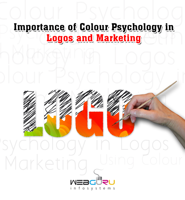
Home Blog Graphic Design Services Importance of Colour Psychology in Logos and Marketing
Importance of Colour Psychology in Logos and Marketing
- 24 Apr / 2014
- 5,608 views
Colours play a significant role in establishing brand recognition especially through logo designs. The colours if properly used in a logo can accentuate your brand identity. Brand recognition is actually the consumer’s ability to identify a product or associate it with a brand. When you are dealing with colour in designing logos, having a clear understanding of colours and colour blending is very important. In order to create a brand mark, marketers establish unique brand identity by employing a definite rule of colours and shapes.
Colour Sells Products
The colours that you use in designing a trademark help in shaping a character for your logo while also letting it stand-out among the rest. It is an influential marketing tool that can have a great impact on a consumer’s decision of why to buy a product. Market professionals as well as designers must understand the psychology of colour for the purpose of using it effectively. Human minds relate colours to meanings and the use of colours that is relevant to company branding and product design can greatly influence the purchasing behaviour of the customer.
Colour Psychology in Marketing
You can see, nearly all products that are sold in today’s time have colourful facades. Choosing the right colours to use in logo designs highly encourages product sales. While there is no single set of formulas to govern colour choices, graphic designers can follow a general guideline based on the principle of associative learning, the relationship between emotion and colour. Companies choose colours for their logos not just for the sake of making them look good, but for communicating certain qualities regarding a service or product.
Conveying Emotions Through Brand
When designing a business logo, you should consider the way people interpret colour. Well, for this first be sure about the kind of emotion you want your brand to convey. Psychological studies have shown that there is a strong correlation between emotional responses and colours, and hence choosing the right colour is essential in determining the medium of your brand visibility.
For example, the logos as well as the store signs of restaurants like Wendy’s, McDonald’s and Burger King have red and yellow to stimulate hunger and convey energy, urgency and speed. Black, gold, white and silver are often used in the logos of luxury brands like Prada, Michael Kors or Chanel to enhance the feeling of sophistication. Companies like Whole Foods use green for their cool logos that convey the message about their environmental awareness.
Colour Emotion Guide for Designing Logos
Here is a guide to the most basic colours, what emotions they evoke, and what products or services they can effectively attract consumers to:
- Red
Emotions: Love, Aggression, Anger, Passion, Intensity, Sensuality
It is often used in logo design to grip the viewer’s attention and make people hungry. Fast food logos mostly have red in them. - Yellow
Emotions: Joy, Cheer, Energy, Positivity, Sunshine, Caution
It is often used in logo design to create happiness, warmth and get attention. This bright colour is highly visible and hence yellow is mostly found on road signs. - Orange
Emotions: Boldness, Pleasure, Distrust, Enthusiasm
Orange is an ideal colour choice for businesses targeting children as their audience. - Blue
Emotions: Trust, Calm, Confidence, Seriousness, Loyalty, Success, Authority
Blue is perhaps the most popular colour for business logos and it is often seen in logo designs for fortune 500 company, medical and government. - Green
Emotions: Harmony, Fresh, Environmental, Ambition, Health, Healing, Finance and Material Wealth
Green indicates life, renewal, abundance and prosperity. This soothing colour is mostly found in real estate, financial and bank logos and companies that want to represent themselves as eco-friendly. - Purple
Emotions: Ambition, Justice, Dignity, Mystery, Royalty, Independence
This colour is the blend of red and blue and purple having both warm and cool properties is seen in many luxury product and educational business logos. - Brown
Emotions: Earth, Woodsy, Comfort, Strength, Richness, Simplicity, Isolation, Utility
Brown is used in construction and legal business logos. - Black
Emotions: Power, Bold, Classic, Mysterious, Grieving, Elegance, Tradition
Black is actually the absence of all colours. It is used in many corporate logos to indicate boldness and sophistication. - White
Emotions: Innocence, Purity, Peace, Truthfulness
This universal colour of peace and harmony is found in logo designs through negative space or reversed typography.
Maximising Business Success with Colour
When it comes to designing logos or other corporate identities, colour is not just an afterthought and it is a way more. Professionals invest enough time in selecting colours that reflect the preferences of the target audience along with the company values leading way to rewards like increased market sales and customer loyalty. Customer awareness, branding and packaging- all these work on different psychological principles. So, if you really want to make the most of using colour successfully, it is crucial to understand these principles well to anticipate and plan how audience will react to the colours chosen.
As the latest colour trends are dynamic and can fluctuate anytime, it is really important to stay up dated current market research on colour to make the best decision for corporate success.

5 comments
Leave a Reply

-
1000+
Happy
Clients -
25+
Countries
Served -
20+
Years of
Trust
I need help with...


Excellent blog with a detailed overview on how colour theory works in logo designing and branding. Thanks for the post.
I think what was said in this article is a very important thing graphic designers need to remember. Not just in logo design but in designing anything for a client. Matching the mood you want the consumer to feel when they see your logo is very important.
Had an amazing overview of the colour psychology that works a great deal in terms of a successful and efficient logo design.
I couldn’t refrain from commenting. Perfectly written!