Home Blog Website Design Services 404 Error Page Design: Is It Just An Error Page?
404 Error Page Design: Is It Just An Error Page?
- 26 May / 2010
- 2,089 views
Most of us are probably familiar with the term “404 Error”. But it is another part of the story that our tryst with 404 Error is not something that we always look forward to. 404 Error page is an HTTP standard response code that indicates that there is a communication problem between the server and a visitor. Whenever a serve fails to find out something that was requested, it displays 404 Error Page, which is specifically designed for this purpose.
Make It Look Good: – 404 Error is often looked upon as something inferior, something below the average. But have you ever checked how many people bump on a page that is no longer exist in reality. Now, in that case, they will see a simple design with a glaring sign “ERROR Page”. The look and feel of your ERROR Page is certainly not quite friendly and therefore, you could not blame your visitors if they bounce back all of a sudden. So, it is quite clear that if you want to do something different this time around, you need to give minute attention to website design. Even if it is an Error Page.
Brand Value: – Do not let the visitor feel that they are lost. Try to form a favorable impression about your website by making your Error Page a little bit interesting and innovative.
Make It Informative: – Make the visitors aware that they are not on the page where they are supposed to be. But the approach should be refined. Try to help them to reach to their desired destination through your Error Page.
Here are some of the best Error Pages that we would like to share with you all:
Bluedaniel.com

It is amazing. You will gape in disbelief when you will bump on this website’s error page. It is developed in flash and you will find it hard to go to the main website.
Chelmsfordlibrary.org

Though thus Error page is not brilliant as far as its graphical quality is concerned, you cannot ignore the underline message. It is website for the academia and therefore, nothing would be more relevant than this particular Error Page. Kudos to them.
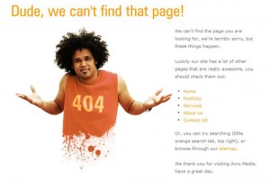
Acromediainc.com

This is a funky, ultra-modern, cool and stylists Error Page that will install hope in visitors that are not lost somewhere. Good concept.
Cssremix.com

Concept is definitely good and beautifully captures visitors’ attention, but what about the links. We think, the designers have forgot all about it.
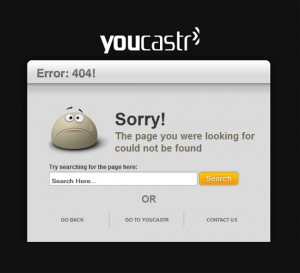
Youcastr.com

The search option is too good. Visitors will find it highly interesting but the graphical quality is not up the mark.
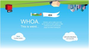
Redtag.com

When you first reach this website, a feeling might creep in your mind that your desktop has got upside-down. Just take a second look. The concept is mind blowing.

-
1000+
Happy
Clients -
25+
Countries
Served -
20+
Years of
Trust


