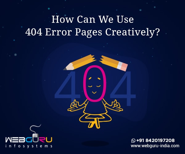
Home Blog Website Design Services How Can You Turn The 404 Error Pages Interesting & Engaging?
How Can You Turn The 404 Error Pages Interesting & Engaging?
- 13 Sep / 2018
- 6,548 views
‘Habit is the nursery of errors,’ Victor Hugo
The ‘Page not found’ or ‘404 error’ is arguably the most annoying and confusing of texts that you can come across on the internet. It is like hitting the dead end of your search tunnel with no light in sight. The mind often wonders why 404? If the grapevine is to be believed, then 404 was the room where the first web server at CERN was placed. Importantly, since user experience has become the be all and end all objective for businesses, thanks to the latest Google broad core algorithm, it is time you become creative with the 404 error page.
So, instead of letting the user stare blankly at some drab messages on the 404 error page, you can turn it engaging with innovative designs laced with subtle humour. Let your visitor sport a wide grin while coming across the 404 page. Use the page creatively to turn him or her into a potential customer. However, before going into the ways in which you can turn your 404 error page into an engaging one, let us know why the page is shown in the first place.
Why does a 404 error page occur?
It occurs when a user is not able to reach a particular web page for the following reasons –
- The page has been removed from the server.
- The page has been moved to a different location without changing the URL.
- The user had typed an incorrect URL.
Although innovation is the key here in catching the attention of the user with some cool graphics, we present 10 ways in which you can use the 404 error page creatively and let it reflect your creativity and customer centric approach.
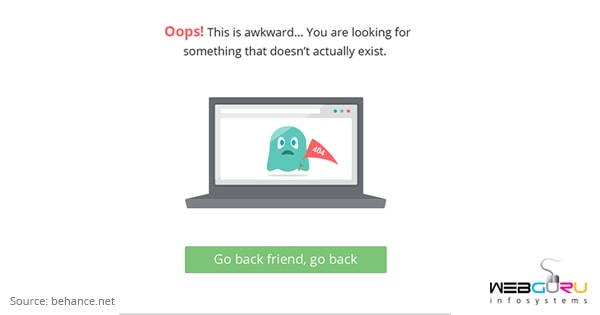
#1 Be honest and come straight to the point
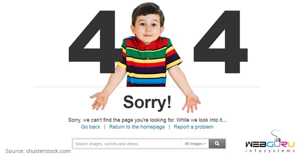
There is no point in beating around the bush when you know why the user has
landed up there (read by typing a wrong URL). So, be honest and make a literal representation of the situation by showing an expression of being ‘Sorry’ for example. In the above picture, the 404 error page is quite candid about expressing to the user that he or she has erred somewhere and has landed up here.
#2 Use humour
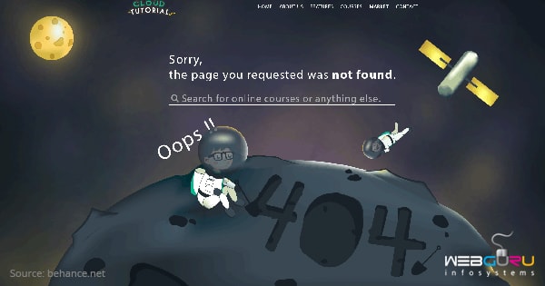
Humour can work wonders by making light of seemingly difficult situations. Usually, the user is confused and probably annoyed at reaching the 404 error page. So, why not turn the situation pleasant with some uncharacteristic humour. For example, in the above mentioned 404 error page, the user is transported into the emptiness of space signifying that he or she is lost. Thereupon comes the cool graphics and CTA button to soothe the nerves of the user.
#3 Keep it simple!
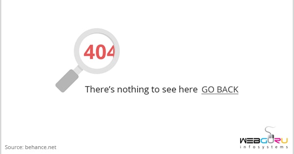
Sometimes simple things can attract and be effective. In the attached 404 error page, there are no extra bits and pieces of info but a simple message for the user. The magnifying glass in the most literal and figurative sense conveys to the user that he or she was searching for something but instead has landed up here.
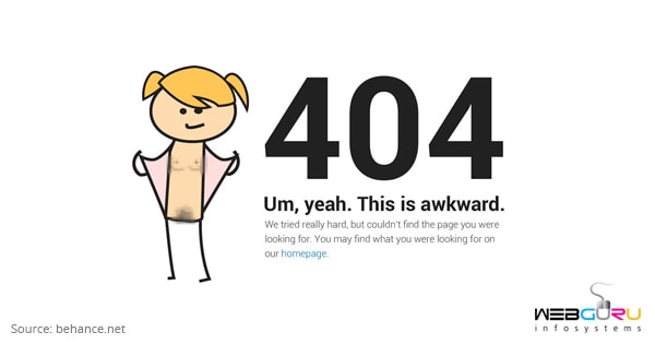
#4 Emotion
Design a 404 error page that draws on the emotion of the user. The character shown in the page appears to be sad (and sorry) as the page searched by the user has been found to be missing. At the same time, the text in green shows empathy in abundant measure and coaxes the user to go back to the home page. Interesting, isn’t it?
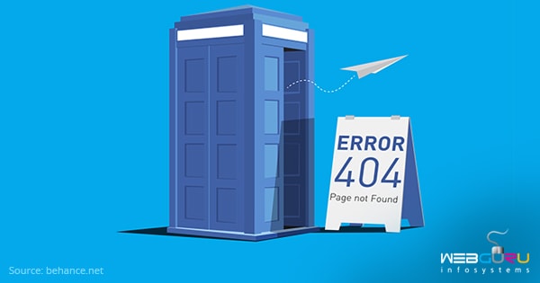
#5 Illustration
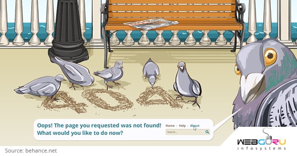
We all like stories when they are interspersed with illustrations. So, why not engage the attention of the user by using them on the 404 error page? In the image, a pigeon looks directly into the eyes of the user telling him or her about the next course of action. Consequently, as a user, you will not flounder and stay confused but instead find the CTA button and return.
#6 Don’t overdo things
Sometimes overdoing things can land you into a soup. It is better to keep things simple by following the current trends. In the attached picture, the quirky character wants to emphasize that there is nothing wrong with reaching the page and not finding the right info.
#7 Overlap images
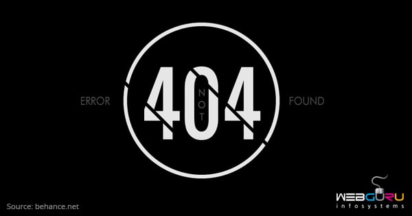
The overlap of colours, effects, shapes, and letters can make an image interesting. The attached image has a simple black and white text circumscribed by a circle. However, the slanted lines on the 404 text add a bit of quirkiness emphasizing the fact that something is amiss.
#8 Use suitable imagery
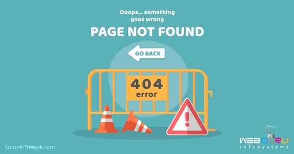
In the above picture, the road barricade serves as the appropriate imagery. It rightly points out to the user that while typing the path to reach a specific webpage, he or she has hit a road block. The image also has a button that redirects the user to the earlier page thus negating any confusion in the user’s mind, which might have arisen on seeing the error page.
#9 Theme colour
It is better to use the theme colour of your brand while designing the 404 error page. It will remind the user that he or she is still not lost and your brand is just around by the side holding his or her hand.
#10 Options
It is a smart idea to present the user with options as to where he or she wants to proceed from the 404 page – back to the homepage, the service pages or the social media accounts of your brand. It is better to give a lot of options to the user making him or her think a while instead of just heading back. This way, you can make the visitor stay longer on your site or the social media page and hopefully, garner a lead.
Conclusion
There are examples aplenty and the sky is the only limit when it comes to designing your 404 error page. The objective is to make it engaging and interesting enough for the user to stay hooked – for a while. Since designing such pages needs creativity, which usually comes out of experience, it is better to engage experienced brand identity design services.

3 comments
Leave a Reply

-
1000+
Happy
Clients -
25+
Countries
Served -
20+
Years of
Trust
I need help with...


Nice Blog for 404 Error Pages.
Very Nice Article
Thank You
Web design is crucial for any business looking to make an impact online. This blog offers great tips!