Home Blog Website Design Services 7 Simple Website Design Tips That Can Give Your Website A Grand Look
7 Simple Website Design Tips That Can Give Your Website A Grand Look
- 22 Jul / 2010
- 2,645 views
You might have mastered the art of website design and possess a certain level of authority on Photoshop but still you find yourself struck in the middle of a project. This is not uncommon given the ever-increasing complexities and cutthroat competition in web design field. Since you are not getting enough time to hone your designing skills, you will run the risk of losing your creative edge that can cost you dearly in the long run. Therefore, we suggest you to take a short break from your busy schedule and try to refresh the basics of website design. Here in this article, we are going to discuss 7 basic website design tips that will help you reinvent your passion for website design:
1. Use of Contrast: –
A slight change in the contrast can make a website look elegant and great. Sometimes, you might find that there is something missing in the final design. At that particular moment, you can try out something different by making some subtle changes in the contrast. If there is anything that deserves to get the attention, you should make it look prominent by making subtle variations in the contrast.
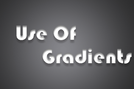
2. Try Gradients: –
This technique is widely used and employed by a sizable section of website design for giving a website a stark visual twist. It can yield an impressive outcome but you need to how to use dexterously. This technique should be employed judiciously and with meticulous precision and it should complete the theme of your website.

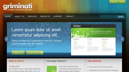
3. Make Your Website Colorful: –
Choosing the best color scheme for a website is certainly a challenging task. It requires intuition and an eye for details otherwise; you might find yourself wasting hours after hours fruitlessly while making a decision in this regard. It is nerve-wracking and often time drives a person to the brink of insanity. Remember one thing that you should not spill colors on a website all the time. All you need to do to use color properly and shun variations if it is not required.

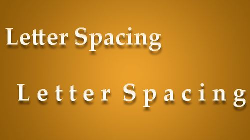
4. Letter Spacing: –
Spacing between letters can play a crucial role in determining the look and feel of a website. There should be enough space between letters otherwise visitors will not be able to figure out what you actually want to convey through it. Make some changes in the letter spaces and you will be in for a shock.

5. Case: –
Chance in Case can be done fairly easily but have you ever thought it immediate impact on the design of a website. Use of uppercase, lowercase or both of them can make your website look dramatically different. But sadly enough there are not many website designers that try to utilize the advantages of this and even some do not think it worthy enough to give much attention.
6. Blur: –
Blur is a powerful and highly effective tool that will let you put emphasis on certain element of a website by blurring something just next to it. The impact of the project can be increased dramatically by blurring different objects either in the background or in the foreground. This is a case of shifting focus to an object by blurring one object.
7. Focus On Alignment: –
Give your website something extra that will help you website to stand tall in the crowd. You can make slight deviation while maintain clean and straight line to give a pleasant surprise to your viewers. By alerting alignment in the design, you make a design memorable and highly effective. This technique does not apply to text only but it is now used extensively in the field of template design.

2 comments
Leave a Reply

-
1000+
Happy
Clients -
25+
Countries
Served -
20+
Years of
Trust


Some great tips here. The use of colours is important depending on what type of website you are looking to create, for example, for a corporate design, I usually keep the colours consistent usually using 3 or 4 but for any other site I tend to use many colours as well as gradient fills and letter spacing.
Excellent! I’ve got this bookmarked for reference. I was searching like this article. It’s awesome, thanks for the great post