Home Blog Website Design Services Common Mistakes that Occur While Designing for Mobile
Common Mistakes that Occur While Designing for Mobile
- 23 Sep / 2014
- 3,129 views
The advent of smartphones and tablets has led to rapid internet usage on these devices as compared to traditional devices like desktops and laptops. There is no doubt about the fact that internet usage will continue to grow on mobile devices and web designers need to focus more and more on how they can offer the users with an enhanced experience. However, simply thinking about the users is not going to do any good as you also need to focus on rectifying the mistakes that are usually committed while designing websites.
Narrowing Down the Feature Set
It has often been observed that web designers get easily carried away from the main objective when they start to add too many features while designing a website.
Should you seek to carry out too many functions, the standard of the experience along with layout will suffer, not to mention, it also poses problem to meet the deadlines.
However, you wouldn’t want to focus too narrowly so that you overlook possibly good suggestions.
During the planning stage, it is always a good idea to note down every idea on paper. Once you are finished you can go through the points noted down so as to make sure that you did not miss out any good idea.
When it is time for you to make a decision, consider only a few points and focus primarily on building a quality experience for the users. Your primary aim should be to create a simple and easy to use application for the users.
You need to make sure that, the features that you add does not lower down the quality of standard that you have set for the application.
Poor Spacing and Alignment
Designers have this complain that ‘designing is a hard task’. Well, in that case, you can make use of analytical precision to ensure that every element within your website is properly aligned. It doesn’t mean that you need to follow some specific web design technique but, there should be a consistency throughout your website design when it comes to spacing and alignment of the elements. There should be adequate padding between every element and usage of white space should be properly utilized.
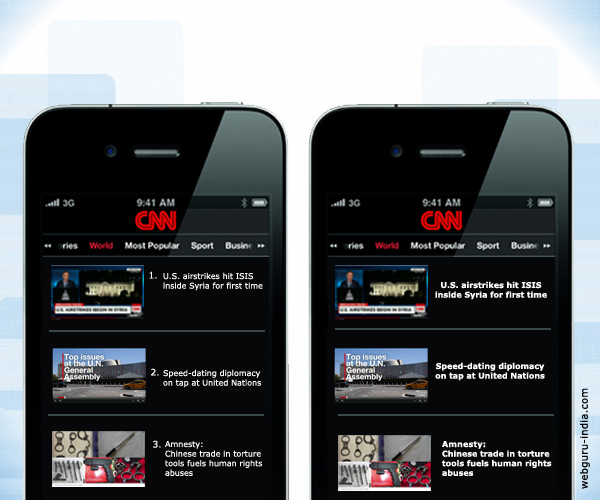
Making Use of Breadcrumbs
Suppose that you are browsing through an app and the interesting content present there, takes you four or five levels deep. Now, you want to move back one level but, tap on the ‘Home’ level in breadcrumbs. Now you again need to make your way back to the content to search for what you were looking for. However, a simple ‘Back’ button at the title bar can make that same task a lot easier. The ‘Back’ button should be designed in such a way that, it changes the label depending on the page it takes you to. You can either name it as “Users” or “Settings” depending on the previous view.

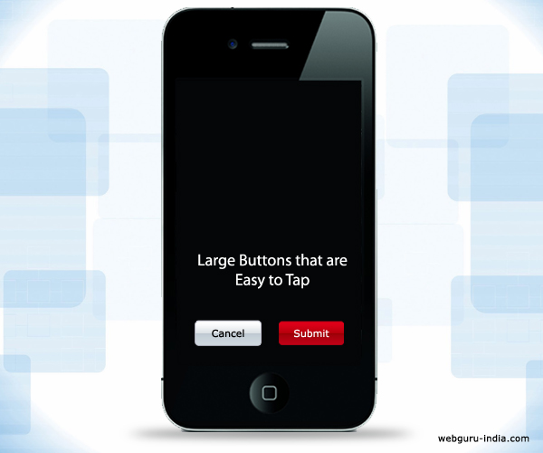
Not Making Use of Finger-sized Tap Targets
Designers often feel the urge to decrease the button sizes to accommodate everything within a mobile screen. 44 pixels square is the minimum recommendation for touch size. Thumbs and fingers come in various sizes and it is quite possible that, things that work out nicely for small hands do not necessarily work well for big hands. Though, the tap target size should be 44 pixels square but, the button outlines need to be of the same size. The target area can be increased so that the button can still be triggered by inaccurate taps.
Title Bars with Logos
For branding an application, logos are commonly placed within the title bars which replace the page name. Though, this works out well for the main page but, when it comes to subsequent pages, the title bar space should be reserved for the title of the page. Through this approach, users not only get the context but the type of content that is available throughout the web page.
Not Paying Attention to Usability Testing
Usability testing happens to be a crucial part of every web design process. Still, a lot of designers tend to avoid it thinking it is a complex process which consumes a huge amount of time. Carrying out usability testing does not mean that you have to hire professionals for the job who will spend days on analyzing your design. Instead, you can get a much more valuable feedback by simply referring your application to a friend or acquaintance. You need to follow closely the places where they get stuck so as to improve those areas and make them more intuitive. At times, even the smallest of changes make a big difference.
Conclusion
These mistakes mentioned here will help you get started with the process of designing accurately for mobile devices. However, usability testing and refining the feature set are the two most crucial concepts that you need to primarily focus on while designing for mobile devices.

1 comment
Leave a Reply

-
1000+
Happy
Clients -
25+
Countries
Served -
20+
Years of
Trust
I need help with...


Yes, these are mostly the mistakes that are committed while designing website for mobile. I love the article…Keep up the good work!!