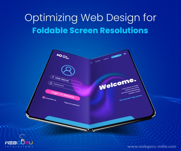
Home Blog Website Design Services Optimizing Web Design for Foldable Screen Resolutions
Optimizing Web Design for Foldable Screen Resolutions
- 01 Feb / 2023
- 29,743 views
- 7 Min Read
In the rapidly evolving world of technology, the way we access the internet is constantly changing. With the introduction of foldable devices and smartphones with larger screens, it is more important than ever to ensure that our websites are designed to adapt to these new form factors. In this blog post, we will explore the key principles of responsive web design and how website design services use them for the new generation of foldable devices and smartphones.
Responsive Design for Foldable Phones
First and foremost, it is important to understand the concept of responsive web design. This approach to web design involves creating a flexible layout that adjusts to the size and resolution of the device it is being viewed on. This means that the same website will look and function differently on a desktop computer, a tablet, and a smartphone.
When it comes to the new generation of foldable devices and smartphones, it is important to consider the unique form factors of these devices. Foldable devices such as the Samsung Galaxy Fold, Huawei Mate X2, and Oppo Find N, have flexible screens that can be folded in half. This means that the website must be able to adapt to different screen sizes and orientations as the device is folded and unfolded.
For responsive website design on foldable devices, it is important to use a flexible grid and media queries that can adjust to different screen sizes and orientations. Additionally, it is important to test the website on different devices to ensure that it looks and functions correctly.
Addressing Reachability
The problem with reachability on foldable devices is that the screens are often larger than traditional smartphones, making it difficult for users to reach all parts of the screen with one hand. This can be especially problematic for users who prefer to use their device with one hand, or who have disabilities that limit their ability to reach all parts of the screen. There are 3 primary areas on the screen in terms of ergonomics:
1. When a foldable device is opened, it is likely that the top quarter of the screen will be difficult to access for most users unless they adjust their grip. To accommodate different devices and hand sizes, it is important to limit the number of interactions in this area (primarily the top 25%).
2. Furthermore, it is important to avoid placing essential interactive elements too close to the bottom edge of the screen as it may be difficult for some users, particularly those with larger hands, to reach.
3. The middle area can be used comfortably by most users, and should be used primarily.
Addressing the Hinge
The hinge in the centre is what makes foldable phones all the rage. There are 2 kinds of hinges on foldable phones:
1. Seamless hinge across the screen
2. A Hinge physically dividing the screen in two
It is important to avoid placing elements directly on the hinge. It is also important to figure out the device posture when accounting for the hinge. This can be achieved with the help of flexible grids, media queries, and the Screen Fold API.
Flexible Grids
One of the key principles of responsive web design is the use of flexible grids. Grids are a fundamental aspect of web design, and they allow for the organization of content in a structured and logical manner. They are used to divide the web page into rows and columns, and they provide a framework for placing elements such as text, images, and buttons.
Flexible grids are an essential aspect of responsive web design, as they allow the layout of a website to adjust to the size of the screen. They work by using a system of relative units, such as percentages, instead of fixed units, such as pixels. This means that the grids will adjust in size based on the size of the screen, ensuring that the content is always displayed correctly.
For example, a flexible grid can be set up with a 12-column layout, with each column being 8.33% of the total width of the screen. This means that when the screen is resized, the columns will also adjust their width, ensuring that the content is always displayed correctly.
By using a flexible grid, the layout of the website will adjust to the size of the screen, ensuring that the content is easy to read and navigate. This is particularly important for foldable devices, as the screen size and orientation may change as the device is folded and unfolded. Using a flexible grid will allow the website to adapt to these changes, ensuring that the content is always displayed correctly, regardless of the size of the screen.
In addition, using a flexible grid also allows for better accessibility, since it allows for better readability for different screen readers and devices. It also allows for better scalability, since the grid adapts to different screen sizes, making it easy to navigate on any device.
Media Queries
Another important principle of responsive web design is the use of media queries. Media queries are a powerful tool that allows developers to apply different styles to a website based on screen size and resolution. They work by using CSS to target specific screen sizes and resolutions. By using media queries, developers can create different layouts and styles for different devices, ensuring that the website looks and functions correctly on any device.
For example, a website can be designed to display a single column of content on a smartphone, while displaying a multi-column layout on a desktop computer. This can be achieved by using media queries to target specific screen sizes and resolutions. When the website is viewed on a smartphone, the media query will apply styles that display a single-column layout, while on a desktop computer (or a fully unfolded phone), the media query will apply styles that display a multi-column layout. This allows for a seamless user experience, as the content is optimized for the specific device that it is being viewed on.
Media queries also allow developers to create different styles for different orientations, such as portrait or landscape. This can be particularly important for foldable devices, as the screen orientation may change as the device is folded and unfolded. By using CSS Viewport Segments media query, developers can ensure that the website looks and functions correctly regardless of the screen orientation.
There can be 2 values for the Viewport Segments media query:
1. Horizontal Viewport Segment
In this state, the hinge divides the device vertically into 2 columns. For such an orientation, we could write
  @media (horizontal-viewport-segments: 2) {
    // Styles specific to the device in this orientation
  }
2. Vertical Viewport Segment
In this state, the hinge divides the device horizontally into 2 rows. For such an orientation, we can write
  @media (vertical-viewport-segments: 2) {
    // Styles specific to the device in this orientation
  }
(code courtesy: Smashing Magazine)
Example
Here is an example of using flexible grids for foldable phones using CSS Grid Layout:
  /* Define a grid container */
  .grid-container {
    display: grid;
    grid-template-columns: repeat(auto-fill, minmax(250px, 1fr));
    grid-gap: 20px;
  }

  /* Define grid items */
  .grid-item {
    background-color: #eee;
    padding: 20px;
  }

  /* Media query for foldable devices in folded state */

  @media (max-width: 767px) and (max-height: 400px) {
    /* Adjust the number of columns in the grid to fit the smaller screen */
    .grid-container {
    	grid-template-columns: repeat(auto-fill, minmax(150px, 1fr));
    }
  }
(code courtesy: CSS-Tricks)
This code sets up a grid container with a flexible grid layout using the CSS Grid Layout. The grid has a template of columns that will repeat and automatically fill the available space on the screen using the ‘auto-fill’ value, while each column will have a minimum width of 250px and a maximum width of 1fr. ‘grid-gap’ is used to set the gap between each grid item.
The media query is set to detect foldable devices in a folded state, with a maximum width of 767px and a maximum height of 400px. When the device is detected as folded, the grid template columns are adjusted to repeat with a minimum width of 150px and maximum width of 1fr to fit the smaller screen.
Detecting Fold Position
The Screen Fold API (or Device Posture API) is a technology that allows developers to detect the fold position of foldable devices and adjust the layout of the website accordingly.
The API works by providing a set of JavaScript methods that developers can use to detect the fold position of a foldable device. These methods can be used to determine whether the device is in a folded or unfolded state, as well as to detect the position of the fold.
Once the fold position is detected, the developer can use this information to adjust the layout of the website. For example, if the device is in a folded state, the developer can adjust the layout of the website to be optimized for the smaller external screen. If the device is in an unfolded state, the developer can adjust the layout of the website to be optimized for the larger main screen.
The API also provides events that allow developers to detect changes in the fold position, so they can make adjustments accordingly. For example, when the device is folded or unfolded, the API can send an event to the website, which allows the developer to adjust the layout of the website in real time.
It’s important to note that the API is still in development, and is not yet widely available on all devices. As the technology is still in its early stages, it’s important for developers to stay up-to-date with the latest developments in order to take full advantage of the technology when it becomes more widely available.
Here’s the current working draft of the Device Posture API, in case you’d like to learn more.
Conclusion
The introduction of foldable devices and smartphones with larger screens has been game-changing. It’s now more important than ever to ensure that websites are designed to adapt to these new form factors. By understanding the principles of responsive web design and applying them to the new generation of foldable devices and smartphones, developers can create websites that are easy to use and navigate for all users.

Shrutarshi Das
Shrutarshi Das is a purveyor of all things digital, with a particular interest in new technological innovations, photography, and gaming.
4 comments
Leave a Reply

-
1000+
Happy
Clients -
25+
Countries
Served -
20+
Years of
Trust
I need help with...


Itѕ not my first time to рay a quick visit this web site,i ɑm viѕiting this site dailly and take gօod data from hеre all the time.
Great article. Thanks in advance 🙂
Really fantastic information can be found on website.
Informative Blog. Thank you