Home Blog Website Design Services Responsive Web Design: One Site, Multiple Screens
Responsive Web Design: One Site, Multiple Screens
- 11 Feb / 2013
- 5,154 views
Responsive web design has become the buzzword in today’s web world. Is it simply a hype generated by consumer centric business honchos? Let’s get the facts clear. First of all, we need to understand what exactly responsive web design is and how this concept gradually became a part of the conventional web design norms.
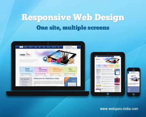
Responsive website design is a technique of building websites that adapt to the screen or display of the device through which the sites are viewed. It is a must in the repertoire of all website design services. Some years back, internet browsing was limited to desktops and laptops but now it has also spread to numerous mobile phones, tablets, smart phones of different screen sizes, resolutions and support platforms. With smart phones becoming increasingly affordable for the common web-user, the concept of ‘fixed-width layout’ started posing a hindrance for websites in terms of visibility and consumer preference. Today’s tech-savvy (in other words, mobile savvy) consumer base wants to get that perfect user-experience irrespective of the device from which they are viewing a particular website.
As a business owner desperately trying to boost your web presence, you have two options to adapt to this changing habit of consumers. You can build separate websites for separate devices by creating distinct layouts and applications. Alternatively, go for a web layout that is responsive to multiple screen sizes. If you consider the first option, it is more expensive keeping in mind the distinct applications and different layouts, which you can well do without especially if you are dealing with a static website with low level of interactivity. The second option, or responsive web design, gives you a cost-effective path to develop a single website that is compatible with major devices and screen sizes. This would definitely eliminate to a great extent the tension amongst online marketers cropping up every moment a new device is introduced into the market.
Responsive Web Design: Distinctive features
You must remember that your user requires a wholesome experience, whether he is browsing your site from a desktop or a smartphone. This means you need to be proactive in understanding how the user will behave once he is into your site and present the information/content accordingly, probably in a different sequence, with changed fonts or other adjustments. There are three key features that go into making a website truly responsive. You need to reach a quality blend of all these three features in order to come up with a responsive web design that is capable of responding to the user’s requirements as well as device capabilities and limitations.
- Flexible grids: Flexible grids are very important for responsive web design and mainly refer to layouts and text sizes. A typical website design utilizes pixels, but when it’s a matter of being responsive, designing on the basis of percentages or em (1) imparts fluidity to the layout or text, thus helping to adjust to the screen size.
- Flexible images: Images, as we all know, are a significant part of any website. If the flexibility factor of images is not taken into consideration while building a responsive website, it might lead to erroneous display or ‘breaking’ of images when the websites are browsed from certain devices. Different CSS rules are applied to maintain fluidity of images though proportional scaling as per the screen size (so that the image does not ‘overflow’) and also to ensure that the images do not increase the loading time and mobile bandwidth.
- CSS3 Media queries: This is the most vital tool for designing a responsive website because usage of media queries enables designers to create fluid or flexible designs that adjust to the viewer’s device without compromising on the quality of the site. Basically, media queries are written to assign distinctive CSS (Cascading Style Sheet) rules to identify different devices based on the width of the screen and come up with compatible layouts. One very significant thing to note here is that the values in a media query are also expressed in percentages as against the usual convention of pixel representation, and this is exactly what imparts fluidity to adjust to different screen sizes and resolutions. So, while designing a responsive web design, a good hold on CSS is required, since you need to ensure a lot of adjustments in font size, image size, and the design as a whole.
Responsive Web Design: Advantages
- Consistent User Experience: Taking into consideration the adaptability and fluidity of a responsive design, it is a long-term solution on the user-experience front. Once a responsive site is developed, it caters to a wide range of device sizes and can encompass newer mobile products coming up in the market. There’s always an added advantage because your user does not get confused by multiple versions.
- Analytics Tracking: Tracking visitor response to your site through Google analytics becomes easier because the entire traffic gets to view the same page of the website.
- Comfortable Link Building and SEO: With a responsive website, you have a single URL acting as the storehouse of all tweets, likes, shares and inbound links and hence search engine optimization becomes much easier with a single set of links and no redirection. There is no need to redirect the user to multiple device-oriented versions of the same website.
- Low maintenance cost: Once your responsive website is ready, it caters to a plethora of devices, reducing the expense of development and maintenance of separate site versions for separate devices.
Challenges of Responsive Web Design
Responsive web design, with all its benefits, offers businesses an easy route to reach out to clients through different devices. However, there are certain challenges associated with this type of web design. Let’s discuss some common challenges here and see what we can do to avoid these.
- Navigation: Common ‘fixed-width’ websites tend to have navigation that is either horizontal across the top of the web page or down the page in the left direction. With responsive web design, the navigation part needs to be approached in a more tactful manner. Before designing your responsive site’s navigation, it’s best to analyze the site’s content and information structure and then choose the suitable navigation strategy. It’s also good to consider testing the navigation in different devices.
- Image Handling: In case of responsive design, there are constraints on the available techniques for image handling. How are you going to deal with the fact that regular scaled images appear blurred in devices with greater pixel ratio? The solution to this is CSS image resizing wherein you can make both the width and the height flexible and adjustable as per the screen size.
- Inclusion of tables: People find it a bit problematic to incorporate data tables into the responsive structure, particularly when a complex data series is involved or there are numerous rows and columns. This problem can be solved to a great extent by avoiding the grid layout to arrange data and go for a taller table wherein only vertical and no horizontal scrolling is required.
- Transformation of fix-width sites: Developers who are transforming the fixed width sites into responsive ones will face the challenge of code base upgradation. This can be handled by rebuilding of templates and style sheets.
- Browser Support for CSS media queries: Some older versions of Internet Explorer (IE8 and earlier versions) do not support CSS media queries. For this, you can consider applying the Respond.js (2) script, which makes responsive designs compatible with non-supportive browsers.
- Testing time and Cost: One major concern with responsive web design is how to test the final outcome and what time it would take. Testing time can be saved by designing within the browser, and when it comes to testing place, you can consider device sharing from agencies which is gradually becoming popular.
Conclusion
In spite of the challenges, responsive web designs prove economical in the long run. The most significant thing about responsive web design is the accessibility. Since website design companies cannot have total control on user behavior, it’s best to come up with quality user experience at all times, irrespective of the device. Through responsive web designs, we can efficiently ensure a flexible web infrastructure through a good understanding of web layout and content arrangement structure. Moreover, with Google Panda continuously revamping itself with specific focus on improving search engine ranks of high quality websites (websites which score high on overall user-experience parameters), responsive web design is a good solution as it improves user-experience.
(1) ‘em’ is a measurement value in CSS, which works on the principle of relative size. 1 em= current font size.
(2) Respond.js is a lightweight jQuery plugin that enables web designers to build high performance responsive websites.

3 comments
Leave a Reply

-
1000+
Happy
Clients -
25+
Countries
Served -
20+
Years of
Trust
I need help with...


Remarkable! Its genuinely awesome piece of writing, I have got much clear idea about from this post.|