Home Blog Graphic Design Services Universal Pictures New Logo Celebrates Our Love for Films
Universal Pictures New Logo Celebrates Our Love for Films
- 05 Nov / 2012
- 6,344 views

Changing with time is a part of growth, and world famous, long existing companies are well aware of this fact. Not only they adapt latest technologies at workplace and rebuild their corporate strategy, but occasionally they refresh their brand identity by changing the logo design to remain popular forever.
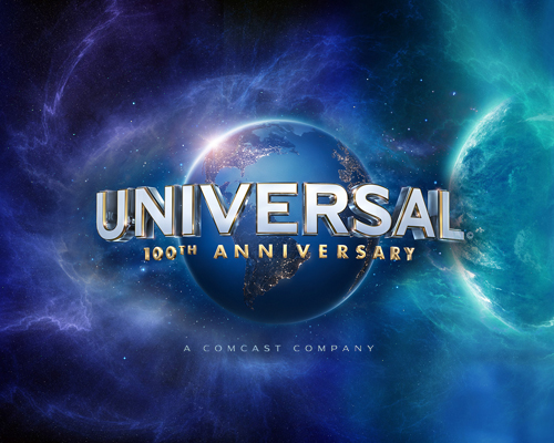
Universal Pictures, the world famous film production company is celebrating its 100th year in film industry this year and to make things memorable, they have come up with a new brand insignia. In the past 100 years, they have changed the emblem 7 times (including this one) to reflect the changing and ever growing face of their business. They never changed the core element, globe, but modified its minute details and added some fresh features to showcase the technological progress of that era.
The new Universal logo was unveiled a few months ago. It’s designed by Weta Digital, the same company that created the special effects wonders in The Lord of The Rings epic trilogy. The insignia features the same blue earth icon, but this time it offers a view of earth from satellites during night. Instead of highlighting the boundaries of continents with lines, the artists have highlighted the continents with small, sparkling, bright lights. Those tiny lights symbolize the unity across cultures and their common love for films.
Did you see the Universal logo yet? What do you think? Is it better than previous designs or not?

Raju Chakraborty
Mr. Raju Chakraborty writes from a place of experience on websites, app development, and digital marketing.

-
1000+
Happy
Clients -
25+
Countries
Served -
20+
Years of
Trust


