Home Blog Website Design Services What Makes Responsive Web Design Different from Adaptive Web Design
What Makes Responsive Web Design Different from Adaptive Web Design
- 01 Aug / 2014
- 3,533 views
In this present world of internet dominance, web developers from different corners of the globe are focusing more on how they can provide easy accessibility of websites across different devices. With new smartphones and tablets being introduced every now and then, it has become the need of the hour for web developers to ensure that users do not face difficulties or hassle while viewing websites on their devices. Responsive web design and adaptive web design are the two methods available to web developers for improving website accessibility on various types of devices. Even though, both of these methods serve the same purpose of rendering websites across different gadgets but, there obviously exists some differences between them.
Responsive Web Design
This approach makes a website easily change its layout according to the screen size of the device being used. The idea is to make effective use of different layouts and flexible grids, media queries along with images to provide users with enhanced viewing experience on various devices. For instance, people using smartphones to navigate different websites get the same type of experience when they switch to some other device, say a laptop or a tablet. The websites react in a way that is similar to liquids being poured in different containers – contracting or expanding to fit the container being used. The various elements present within a responsive website change their placement and look to display the content properly depending on the screen size. The entire operation takes place on the client side where pages are sent to device browser (client) and modified in accordance with the screen size of browser window.
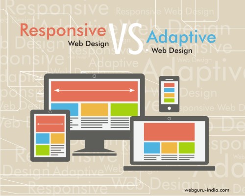
Adaptive Web Design
Predefined layouts are used in this method which has been specifically developed for different screen sizes. The activation of a specific layout takes place after the detection of the device’s screen size viewing the site. The device used to view the website is detected by the server and the appropriate template is accordingly used to offer users with an enhanced experience. “Breakpoints” are used by the designers in case of adaptive websites where design changes – and the designer has the entire control over how it changes.
Primary Differences between Responsive and Adaptive Web Design
The main difference between these two web design techniques is that, responsive design fluidly changes and adjusts layout depending on device screen size whereas adaptive design relies on predefined size layouts developed for the device being used. Some of the other differences are:
- Responsive design happens to be a client side process where the page is delivered to a browser and changes accordingly take place with respect to browser window dimensions. Adaptive web design on the other hand is server side where the device attributes are detected by the server before the page is delivered. An optimized website version is loaded based on the native features and dimensions of the website.
- In case of adaptive websites, pre-selected content is downloaded based on the device of the user however responsive websites do not require such mechanism. The same content appears seamlessly across all types of devices with varying screen sizes.
- Responsive design depends primarily on fluid grids, media queries and CSS3 but, adaptive design depends mainly on predefined layouts. A huge amount of implementation strategies as well as coding is necessary for responsive design whereas the streamlined approach of adaptive design saves a lot of trouble for the web developers.
- Images of websites developed using responsive design are downloaded and re-sized depending on device being used. However, websites using adaptive designing consist of images optimized specifically for various screen resolutions.
Conclusion
Choosing between responsive and adaptive web design is entirely dependent on whether a business wants to target a broader audience or a smaller target market. Responsive web design no doubt, works wonderfully for modern day tablets and smartphones but, adaptive design turns out to be the best option for really limited or old mobile phones. Whatever might be the approach, the ultimate goal is always to provide the users with an enhanced experience that helps them to accomplish their tasks in an easy and hassle free manner.


-
1000+
Happy
Clients -
25+
Countries
Served -
20+
Years of
Trust
I need help with...


