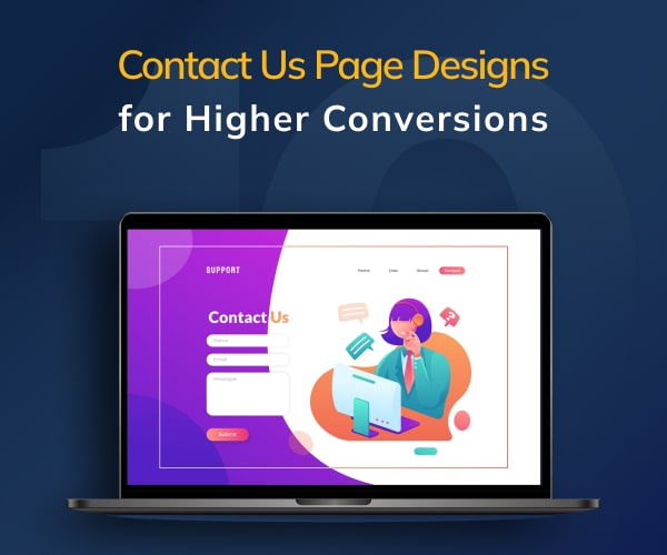
Home Blog Website Development Contact Us Page Designs for Higher Conversions
Contact Us Page Designs for Higher Conversions
- 01 Jun / 2022
- 3,697 views
The website is a powerful digital touchpoint for any organization looking to achieve conversions. However, not every website can claim to have a good conversion rate (above 10% as per webfx.com). With website design being one of the aspects driving conversions, what should be the focus area for any website development company or a business enterprise? Is it the homepage, product or service pages, animated effects, or the blog page? And what about the contact us page? – the name that packs a punch in the form of a Call-to-Action?
Do not ignore the contact us page
It has been noticed that the Contact Us page, arguably one of the most valuable pages in a website, is often at the bottom of the priority list of developers. Thus, a website might have a sleek design but its Contact Us page can look dated. This is a huge mistake, which can cost a business dear with low conversions. Remember, your Contact Us page should create a positive impression on the visitors and not have generic templates. So, what needs to be done? What should a perfect Contact Us page look like that ticks all the right boxes? Let us discuss the same in the below-mentioned segment.
How should a great contact us page look like
The Contact Us page on your website is not another page. It provides an overview of your brand and guides your existing or potential customers to engage with your business. However, more often than not, the Contact Us pages are not given their due and are crafted as an afterthought. The issues plaguing typical Contact Us pages may include an outdated design, wrong or missing information (phone number or email id), or missing links to the social media channels.
Remember, any Contact Us page should look clean and its design should reflect your brand’s identity. And more than your personal preferences, it should deliver a great user experience. A great Contact Us page ought to have certain elements or fulfill certain criteria to meet customer expectations.
Key elements of a contact us page
- Easy to find so that visitors can get in touch with you quickly.
- Explain to visitors why they should contact you and how you can address their requirements.
- Your phone number and email for the visitors to contact you quickly.
- A short form for the visitors to fill in the information (name, phone number, email, purpose, etc.)
- Upon submission of the form, redirect visitors to a thank-you page showing when and how will you contact them.
- A secondary CTA button for those visitors who don’t want to fill the form when landing on your Contact Us page. This button can be directed to your blog section, the home/product/services page, or a product demo video, among others.
- No fluff by avoiding unnecessary fields.
- Show the company’s thought leadership by adding a blog post or any articles published in the press.
- Have links to the active social media accounts of your company on Facebook, LinkedIn, Twitter, and Instagram. This way, you can give another way to the visitors to engage with your business.
It’s simple! If someone has visited your Contact Us page, he or she is likely to contact you and know about your business. So, your Contact Us page should be more than just a generic email address and a phone number and contain elements that are mentioned above. Now that you have understood the elements a Contact Us should have, let us discuss 10 different page designs for the Contact Us page to drive higher conversions.
Different contact us page designs to drive higher conversions
To help you understand better how a Contact Us page design can drive higher conversions, we have collated for you 10 different page designs from various brands. We have explained why we liked the particular design. In the end, we hope you would be better placed to design/redesign your Contact Us page – either in-house or by engaging an experienced company offering quality website design services.
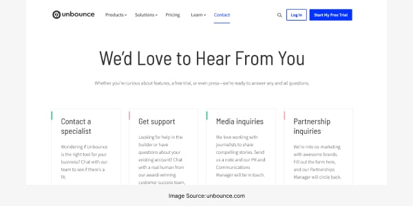
#1. Unbounce
#2. Webguru Infosystems
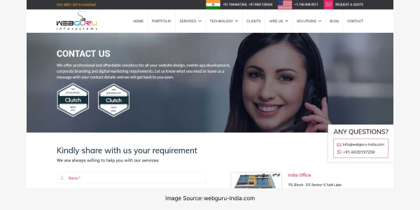
The Contact Us page of Webguru Infosystems lists out the services provided by the company at the beginning and calls visitors to fill the form with their information. It prominently displays the company’s India and US addresses, various clients or brand names, and the workplace. The imagery is likely to leave a positive imprint on the visitors. Moreover, the simple form containing a few fields does not overwhelm the visitor with plenty of information to fill. This can go a long way in generating better user experience.
#3. HubSpot
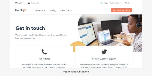
The contact page of Hubspot exemplifies how it can serve as a tool for providing customer service.
With two CTAs connecting visitors to Sales and Customer Support, the page provides proactive customer service. Also, it gives the company the understanding that people visiting the page are likely to need help with troubleshooting or purchasing stuff. And should someone be working in the portal needs a phone number to get support, he or she wouldn’t have to look elsewhere. This offers an omnichannel experience to the customers.
#4. Yeti
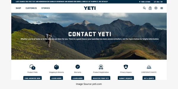
The contact page of Yeti, a company selling drinkware and coolers, stands out for its clever tagline in the banner section and cool looks. It provides multiple ways to connect across platforms. The image of a hiker in the mountain is contrasted well with a clear and white background below to make the contact info and CTAs clear. Also, the page provides links to the company’s knowledge base thereby helping visitors get quick replies to their queries.
#5. Slack
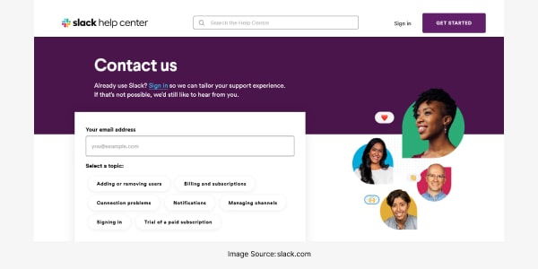
Slack asks a simple question to the visitor about the reason for making contact. Also, the page shows the images of a few faces implying that no automated bot will respond to the customer queries but real people. This generates a positive vibe among visitors with the knowledge that their queries or complaints will be taken care of.
#6. Brandaffair
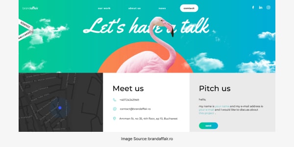
The contact page of Brandaffair, a marketing agency, encourages visitors to talk ‘one-one-one’ instead of the usual one-way channel of communication. This design captures the visitor’s attention with a beautiful picture of a pink flamingo at the top and multiple methods of communication. Besides, the map shows the exact location of the office. The channels of contact, namely, “meet us” and “pitch us” help visitors submit their ideas to the company.
#7. Scribd
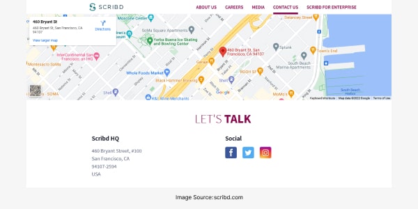
The contact page of Scribd, a digital library, looks inviting with the company’s head office shown on Google Maps. There is an array of buttons for visitors to choose the resource they require – send an email or chat with the customer service. The design is quite unique and saves time for visitors and customer service employees. For a website allowing visitors to browse through a raft of digital resources, namely, magazines, books, audiobooks, news articles, and others, the page is quite simple to use.
#8. Morroni
Morroni uses humour tactfully by giving the option to the visitor of either picking up the phone or filling the form. The colourful design upfront complements the text and catches the eye. Today, most visitors are likely to fill out the Contact form instead of talking to someone upfront. Thus, it is important to show questions that will help the visitor to understand your business better. These questions may help your business to categorize or qualify him or her as a quality lead.
#9. Ulta Beauty
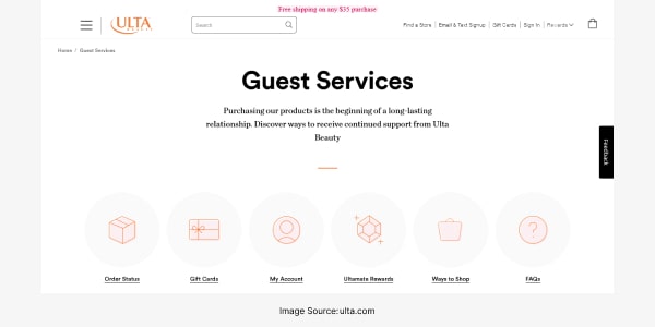
The website of Ulta Beauty provides users with various ways to reach out to its support team. It has several FAQ links to help users get information without contacting customer service. The links fulfill the users’ need of getting answers to a host of questions. These may include the ingredients of an eyeliner, an alternative to the primer, or whether the foundation is likely to affect the skin, among others. The page creates a balance between availing of self-service options as well as contacting customer support.
#10. Infinum
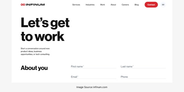
The welcoming message on the Contact page of Infinum “Let’s get to work” creates a positive vibe upfront. The simple design of this page with options ‘About you’ and ‘About your project’ makes it easy to understand and navigate. It’s simple, friendly, and helpful.
The above-mentioned designs can give you suitable insights to design/redesign your Contact Us page and make it more relevant and engaging for the visitors. However, to ensure the whole digital experience remains top-notch, build an attractive and user-friendly website. Here’s a blog to know more about the latest trends on website development.
Final thoughts on contact us page design
It is important that you create a thoughtful Contact Us form rather than rushing through its design. A simple, user-friendly, and attractive page design can help visitors connect with you and convert into customers. When creating a Contact Us page, design it as per the nature of your business. In case you find it challenging, you may hire professionals from an experienced website development company and turn your Contact Us page into an important part of the sales funnel.

Priyanka Agarwal
An expert digital marketer with vast knowledge in SEO, SMO, and the like, Priyanka Agarwal writes about the latest trends in digital marketing.
3 comments
Leave a Reply

-
1000+
Happy
Clients -
25+
Countries
Served -
20+
Years of
Trust
I need help with...


Indeed, a contact us page is one of the most important pages on a website where visitors like me can connect with the owner or customer support team. The blog gives a lucid exposition of the elements a contact us page should contain—a good read.
This blog intimates us about the importance of a contact us page and also what elements should be there on this page in particular. Great to read!
Thank You, Mr. Raju Chakraborty, for sharing an important post on The Contact Us Page.I will share your writing with students taking Sales Training Courses