Home Blog Graphic Design Services Different Ways to Revamp Your Company Logo
Different Ways to Revamp Your Company Logo
- 11 Oct / 2014
- 4,574 views
Logos are regarded as the perfect representations of the image of a business helping people to associate it with its products and/or services. Though majority of businesses nowadays have a logo but there comes a time when they feel that their logo is just not making the right sense. The reasons to redesign a company logo may be many however it is not that easy as it sounds. You need to ask yourself various questions like:
- What are the elements that should remain within the logo?
- How much of the design should be revamped or changed?
- Will the modifications in the logo really help your brand?
After figuring out what needs to be done refer to the points mentioned below to add that extra effect and appeal to your logo.
Replace the Font
When you want to increase the reach of your business and target new markets, the need to alter the font of your logo may become a necessity. Let’s say, your business has a text based logo where you made use of the Serif font to appeal to the older generation. Now you want to expand your business and appeal to the younger generations. So, what would be the best thing to do? You can change the logo font from Serif to Sans-Serif just to make it a bit livelier and charming.
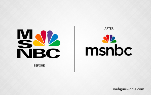
Take the case of MSNBC logo where the original design consisted of super heavy uppercase typeface making it a bit too much for a news station. However, their newer logo looks more aesthetically pleasing and attractive with its lowercase typeface.
Trim Down Your Logo
Be it website design or logo design, minimalism has turned out to be biggest trend these days simply because of the fact that it makes sense and works. If you think that your logo has too many unnecessary elements making it confusing to the audience then, trimming it down is the best option available to you. Unlike a busier design, a simple design is appealing and easily recognizable.
If you take a look at the latest Starbucks logo and compare it with the one that was previously used then, you’ll be able to understand how trimming it down has really helped. The company’s plans of venturing outside the coffee business clearly reflect in the new logo with the removal of the “Starbucks Coffee” text.

Changing Colors
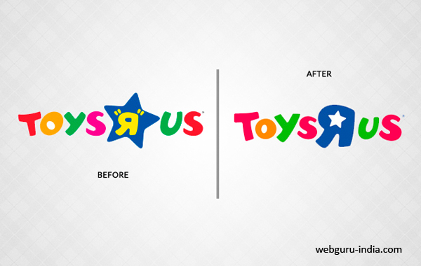
It is well known fact that, colors can invoke certain feelings and emotions. Choosing the appropriate colors not only makes your logo look good but, also helps with your branding efforts. Colors have a lasting effect on the mind and help your customers to remember your business and brand. The redesigned logo of Toys R Us looks a lot less primary adding that extra bit of fun perfect for a toy seller.
Simplification
In order to meet the specifications of the client, designers often tend to make logos extremely busy and generic. A good thing to follow while designing a company logo is to break down and simplify the design so as to come up with something eye-catchy and meaningful.
Look at Wendy’s logo for instance and see how its new simplified design creates an inviting effect and radiates freshness. The simplified design of Wendy’s logo has certainly made it stand out amongst its competitors by leveraging cleanliness and friendliness.
Product/Service Centric
Though, it is always advisable to keep your logo simple and unique but, at times you may feel the need to add some touch of excitement that perfectly compliment your business activities. You can also apply a theme that is central to what your product and/or service does to get rid of that boring effect.
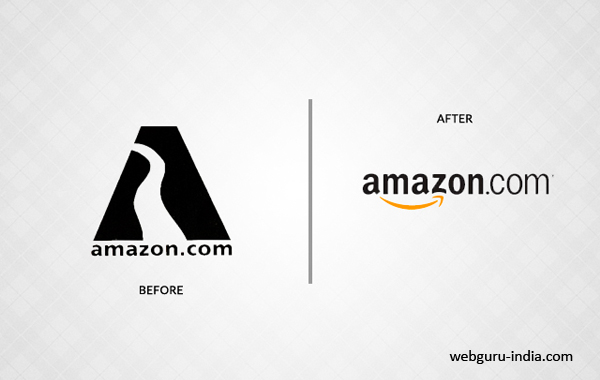
For instance, the previous logo of Amazon.com referred to the Amazon River which made no sense at all. But, thanks to some clever redesign, the company now has a logo that perfectly represents its business. The arrow from ‘A’ to ‘Z’ not only indicates that you can get any product from its online store but also looks like a smile signifying something more.
Last Words
It may be 6 months, 1 year or more but, you will definitely feel the need to change the design of your logo at some point of time to keep up with the market requirements as well as showcase some changes in your business strategy. Apart from paying attention to what your business does, remain inspired and creative to present your ideas in a fresh, appealing and unique manner through your logo.

1 comment
Leave a Reply

-
1000+
Happy
Clients -
25+
Countries
Served -
20+
Years of
Trust
I need help with...


Without going much into the details, you have nicely explained the process through which a logo can be easily revamped.