Home Blog Website Design Services Exploring a Designer’s Role in Responsive Web Design
Exploring a Designer’s Role in Responsive Web Design
- 01 Jul / 2013
- 5,654 views

With the persistence of mobile dominance, the role of a designer has become increasingly important in the process of creating a responsive website design. Conventionally, the role of a designer is restricted to giving proper direction to the content, offering a vision for the site design, and placing the content in the most effective approach. With time, the role has become better and richer. Website design services now have to create sites that adjust to the screen sizes of a range of devices namely, iPad, tablets, Smartphone, desktops, and laptops.
Designer’s Role in Responsive Web Design
The role of the primary designer today is important. While it is wholly possible to build a website yourself, we have broken down into points why the process is best left to an expert.
Content is the King
During the late 1990s and the beginning of the 2000s, the maximum number of websites focused on the extensive use of animation and images. It was considered a visible trend of this particular period. In general, the animations, images, and graphical representation were mostly used in the introductory page of a site and were carried over for around 5-10 seconds. Such an inclusion often left the visitors and prospective users of the site sit through the entire introduction, prior to entering the site.
This particular trend dominated the field of website design, until the introduction of the web 2.0 era. This age introduced the trend of using nonsensical images, almost compelling the users to scroll down the page for having an access to the real content. This period witnessed a distraction among designers as they would often get lost between evolving trends and the actual design purpose that focused around effective content placement making it beneficial for the users.
However, the latest development of the responsive design trend has made things easier for the designers. The evolution of this particular trend that focused on creating websites that would fit in a wide range of devices without any complexity helped the designers serve the actual purpose of efficient placement of content better. Today, users accessing a website through any device can expect having a consistent and regular visual experience with the focus on content.
The Process Involved
The primary task while beginning the process of responsive web design includes coordinating with the content providers or the communicators. This is mostly done to determine the priority and focus of the content placed on the site. Generally, the designers help in deciding the content types that are more important and valuable for the prospective users of a particular site alongside focusing on the purpose of displaying the content at its best.
This particular knowledge in determining the content priority is being used for designing a fully functional and rich responsive website. The approach is easy, if a content is important for a mobile device, it holds equal importance for desktops as well. Following the process of determining a content’s priority and importance in terms of the user’s needs and interest, the shift is made to the visual process.
Experiencing the Design Process
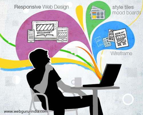
Prior to beginning the process of designing a website, it is necessary to develop a wireframe for maintaining an efficient approach in the process. This stage requires every designer to sit with the developer and sketch a rough plan for the prioritized content along with the visual functionality. Additionally, it also aids a designer to place the contents in right coordination with the functions and elements without the need of perfecting the finer design details.
A nicely built wireframe allows presenting minimum two or three size considerations for a layout (for instance for desktops/laptops, mobiles, and tablets). Usually, these considerations make use of the structure of content importance for the layout basis. Completion of this stage offers the developers with a near to perfect roadmap for the website development structure. Following the advancements, the designers need to attach visual elements to the wireframe developed structure.
To achieve this, a combination of style tiles, mood boards, and compositions can be devised keeping in mind the considerations of mobile and desktop search. Creating a combination of style tiles and mood boards enable the designer to build elements, determine visual direction, and propose function without developing a complete composition. This particular process helps the designer to have a look at the different design approach along with its functionality and appearance in a range of devices.
Enhanced Responsibility of a Designer
When it comes to responsive website design, the designers usually tend to enjoy an important and integral role determining the success of a website. The responsive approach actually breaks the barriers of the conventional rule that focused on content placement and visual experience. Today, it is more about reaching beyond the conventional rules and Photoshop compositions.
The role in the present age focuses more on aspects like determining the content flow in a range of devices alongside maintaining an equal functionality of the site. To get the best of responsive website designs, business owners must always hand over the task to professionals featuring the right blend of expertise and technical knowledge.
2 comments
Leave a Reply

-
1000+
Happy
Clients -
25+
Countries
Served -
20+
Years of
Trust


Hi,
Very nice Article. Thank you for sharing useful information.
nice blog