Home Blog Website Design Services Reasons Why Your Business Requires Website with Responsive Layouts
Reasons Why Your Business Requires Website with Responsive Layouts
- 03 Feb / 2016
- 4,375 views
Every business requires a website for ensuring its progress and resultant success. But, today it is not just about looking good on the monitor of a desktop computer. Swift progress in the extensive field of Mobile Technology has led several portable devices including Smartphones and Tablets etc. to become the inseparable parts of modern-generation lifestyle. In this fast-paced modern world, people do not wait to get home to go online, since these phones can do everything that a computer can do.
It is obvious that the screen resolutions and aspect ratio would vary while using these portable devices. Often, the Tablets and Smartphones fail to showcase the web content in a proper way. Responsive design has appeared as a knight in a shining armor to fix this issue.
Advantages of Responsive Design
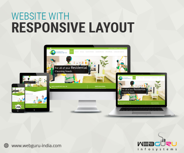
Today, Responsive design has reared its head as a very common feature in most website themes and templates. Websites with such design are developed to automatically fit to any screen size, giving the visitors an optimal viewing experience no matter which device they are relying on. Here are a few important reasons to consider making the switch. Have a look-
- Search engine advantages: Search engine is intended to return results that allow a good user experience. Mobile and Tablet friendly search results always stand out in the overall ranking. Most of the users tend to switch to another site, if they find a poor performance of a website on the mobile devices.
Such designs offer a better user-experience and subsequently, ensure improvement of the search engine optimization. Moreover, the latest update of search engine giant Google says that the mobile friendly websites will have a better chance to rank in the search results.
- Consistent user experience: This design is flexible and would adapt its layout depending on the size of a user screen. It ensures that your website will always proffer the best possible experience to its viewers. Plus, it does not take too long to load. Thus, it determines a better user experience by enabling the internet users to get their information in no time. In a nutshell, Responsive design is all about providing a consistent and an enriching user experience regardless of whether the users use a Laptop, a Smartphone or a Tablet.
- Increase sales: User-friendly Responsive websites do a better job in converting visitors into customers. By eradicating all the barriers to your website, this web structure will lead to a quicker intake of the customers. Aside from increasing the sales, it helps analyze a website’s overall performance.
Research says that most of the users who visited a mobile-friendly site have a tendency to get back to the same site in future for making a purchase. By providing a unified experience, easy navigation facility and consistent usability, this site always ends up boosting the sales.
- Information is accessible: Responsive Design has projected to the screen after the content layouts are calculated according to the screen size and resolution of a portable device. Armed with this optimal approach, the web pages are always displayed better as well as faster, with ideal font size. Hence, the device capabilities never become an impediment to the desired information or ideal display.
Conclusion
Responsive design has spread like wildfire in the last couple of years. Today, almost every website design company out there offers responsive website design. With loads of impeccable functionalities, this web design can really help your business stay ahead of the competition always.

4 comments
Leave a Reply

-
1000+
Happy
Clients -
25+
Countries
Served -
20+
Years of
Trust
I need help with...


Great post. I was checking constantly this blog and I am impressed! Extremely helpful info specially the last part 🙂 I care for such info much. I was looking for this particular information for a very long time.Thank you and good luck.
Thank you for your comment.
Very true! Since smart phone and mobile devices are ruling the era, businesses can’t afford to ignore customer usability and experience.
Great info! Thanks!