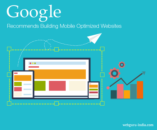
Home Blog Website Design Services Why Google Recommends Building Mobile Optimized Websites
Why Google Recommends Building Mobile Optimized Websites
- 07 Jul / 2015
- 3,613 views
In 2015, Google rolled out its mobile-friendly update, dubbed ‘Mobilegeddon’. It took a clear stance on mobile Search Engine Optimization practices, and talked about a change to the search engine algorithms which as a ranking signal now impacts on a website’s mobile presence.
To put it simply, a website needs to be usable on a Smartphone. This includes elements, for instance, readable text without having the requirement of zoom, sufficient space for tap targets, as well as no horizontal scrolling.
Responsive website design (RWD) is a setup where the server all the time sends the same HTML code to all devices and CSS is applied to alter the display of the page on the device. Google’s algorithms should be able to detect this setup automatically if all Googlebot user agents are allowed to crawl the page along with its assets (JavaScript, CSS and images).
What is Responsive Website Design?
In the past, more than one website was developed so as to accommodate multiple screen sizes. RWD creates a system for a single site to respond to the users’ device sizes — with one URL as well as one content source. A responsive web design offers a fluid and flexible layout which adjusts in accordance with the screen size, providing an optimized browsing experience. Basically, your website will work well and look great on a laptop or desktop, a tablet, and a phone’s browser.
RWD Is the Need of the Hour
If you can recall the shrunken version of a desktop site on your handset, you must remember that it was just not an optimal experience. Internationally, the number of worldwide Smartphone users stands at about 6.65 billion in 2022. Owing to the increased number of users as well as the rapid growth in the mobile market, websites need to be optimized for smaller screen devices so as to avoid experiencing a decline in their search engine rankings.
More than 60 percent of searches nowadays come from a mobile device. For the purpose of ensuring that your site offers a user experience customized to smaller screen devices with no separate app creation, you should consider implementing a RWD for mobile.
Benefits of RWD for Mobile
The greatest benefit of a responsive website design services is the assurance that a user will have the best possible and the most consistent experience on your website from any device. It’s also an excellent way to refine the content on your site, guaranteeing that those using a smaller screen device are only viewing the most vital information.
With the recent Google algorithm update, a RWD is mobile-friendly and it increases visibility on search engines for a website. A website with a successful mobile experience will show up on search results at a better position.
Why Google Recommends RWD?
- Makes it simpler for users to share and link to website content with only one URL
- Helps Google’s algorithms precisely assign indexing properties to the page instead of requiring signaling the existence of corresponding mobile or desktop pages
- Requires reduced engineering time to maintain different pages for the same content
- Decreases the possibility of the common errors that affect mobile sites
- Needs no redirection for users to give a device-optimized view and reduces load time
- Saves resources while Googlebot crawls the website
For RWD pages, a single Googlebot user agent requires crawling your page just once, instead of crawling several times with multiple Googlebot user agents for retrieving all versions of the content. This enhancement in crawling efficiency can in a roundabout way help Google index more of your website’s content and keep it aptly fresh.
Conclusion
The endgame of implementing a responsive design is accessibility. If your website is accessible to more people across a multitude of devices, then it’s your business that benefits. Responsive website design is now commonplace across most websites. Make sure you don’t miss out.

5 comments
Leave a Reply

-
1000+
Happy
Clients -
25+
Countries
Served -
20+
Years of
Trust
I need help with...


It’s a nice, brief description of the benefits of responsive website design for businesses. Enjoyed reading the blog!
Got to know the truth about adaptive or responsive website design along with the latest Google recommendation on mobile friendly website design.
Responsive website design for business is the assurance that a user will have the best possible and the most consistent experience on your website on any device.
Responsive website design is a time sends the same HTML code to all devices. fast accesible. Thax for sharing this Article..
Thanks for discussing one of the latest topics! It’s truly important to keep ourselves updated with fresh Google updates on website designs.