Home Blog Website Design Services Separate Mobile Version or a Responsive Website?
Separate Mobile Version or a Responsive Website?
- 18 Sep / 2014
- 4,576 views
The way the internet is accessed in the present day world has vastly changed from what it was until a decade back. The advent of smartphones and tablets has made it easier for people to access the web even when they are on the move. However, despite increased browsing, the conversion rates through mobile devices haven’t matched up to their desktop counterparts thus, leaving room for further improvement when it comes to mobile experience. Yes, even in 2022.
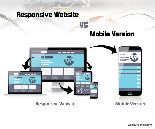
Online merchants are now in a dilemma whether to design a responsive website or a standalone mobile website to offer their customers with an enhanced user experience. This is a highly critical decision which can have significant impact on the way visitors interact with a website as well as influence the conversion rates. And this is a decision that the merchants must make with their chosen website design services.
Separate Mobile Version or a Responsive Website?
Here’s a look at the advantages and disadvantages of both approaches so that it becomes easy for online merchants to decide upon the technique that best suits their business needs.
Layout of Content
The primary purpose of a standalone mobile website is to offer the users with precise information from a mobile device. But, at times users cannot find the content they are searching for from a mobile device simply because of the fact that it has been removed to render a better experience. This leads to accusations of content being ‘dumped down’.
On the other hand, responsive design easily takes care of such accusations as this type of approach ensures that content is provided in its entirety. Without any redirections or broken links, users get the exact content on their mobile devices that are also rendered on desktops or laptops.
SEO
There is absolutely no doubt about the fact that SEO of a website requires a lot of thought process, hard work and effort. While creating an amazing mobile website, people also need to consider the fact that additional SEO efforts will be required to optimize that site as well. The primary website does not serve any purpose here and they are required to start from scratch.
The best part about designing a responsive layout is that it does not involve any extra efforts to be put in for SEO thus, providing the opportunity to reduce costs as well as improve performance of different campaigns.
Resource and Cost
Standalone mobile websites require more maintenance and upkeep. The cost also depends on the functionality and scope identified while developing an online strategy for every website.
Responsive web design is definitely a cost-effective approach where the same website is used across multiple devices. A responsive website makes use of the same codebase as that of the desktop version. Content changes and updates need to be carried out only once for a responsive website, and converting your website to a mobile friendly design is a relatively cost-effective affair.
User Experience
Where user experience is concerned, standalone websites surely score over responsive websites as every website for a mobile device is customized for the users. Superior loading times, absence of large images and well laid out clickable buttons ensure that users can easily browse and search for the information they are looking for from their mobile device.
On the other hand, the responsive design approach ensures that it stays accessible and the users are provided with a consistent experience across all devices. However at times, the loading time can create problems. Studies have revealed that nearly sixty five percent of responsive websites have load times of more than four seconds which has been deemed unacceptable by experts of the industry.
Conclusion
Choosing between standalone mobile websites and responsive websites is no doubt a confusing task and mainly depends on the goals and specific needs of a website. However, there is a strong belief among industry professionals and website development companies worldwide that responsive design is all set to rule the web designing market in the future mostly because of its cost saving benefits and easy rendering across devices of all shapes and sizes.
Related Article: Optimizing Web Design For Foldable Screen Resolutions.

2 comments
Leave a Reply

-
1000+
Happy
Clients -
25+
Countries
Served -
20+
Years of
Trust
I need help with...


Very nice article ,very useful.