Home Blog Graphic Design Services The Subconscious Influence of Colors and Shapes in Logos
The Subconscious Influence of Colors and Shapes in Logos
- 05 Feb / 2024
- 3,550 views
- 7 Min Read
When a common man can identify a brand by its logo, it’s a testament to the engaging design elements and successful branding efforts of a company. When you think of brands like Apple, Puma, and Nike, you can almost visualise a half-bitten apple, a leaping Puma, and a swoosh. However, it’s also true that these iconic logos didn’t become famous overnight.
Not only did these brands grow by developing strong connections with their audience and customers over time, but their unique logo also played a part in distinguishing them from their competitors. When it comes to establishing a strong brand identity, investing in high-quality logo design services is a smart choice for any business. It should be noted that by making thoughtful branding decisions and striking logo designs, they become successful in getting their audience’s attention. “Logos are essential for developing brand identity because they provide a recognisable and memorable symbol that 75% of consumers associate with a particular company or product.” (Source: Linearity)
That’s why we’re going to find out what psychological and emotional implications colour, shape, and font can have on logos.
Reasons to choose certain brands amidst several others in the market
Imagine yourself in a general shoe store, buying sportswear for your upcoming vacation. After making your choice based on your size, you are now heading to the cash counter to make the payment and head back home. This is a common scenario for anybody buying their shoes, but few ask themselves why they pick a particular shoe out of the rest of the collections. Is it entirely because of the colour? Only for the low price? Find the few factors that we consider when buying a product or service from the market in the points given below.
- Brand loyalty
- Self identification
- Social identity
- Familiarity
- Status
- Social identity
- Emotional associations
It needs to be understood that when assessing brands, customers are more inclined to make a choice that appeals to their emotions. Having said that, it’s essential for a company to convey their brand’s identity in an appealing way to their target audience. On the other hand, it is also true that busy shoppers don’t have the time to do detailed research every time they’re making a buying choice. Such purchase decisions are entirely instinctive and based on emotion.
For instance, if you are in a grocery store and they’ve run out of your favourite biscuit brand, what will you do next? You will naturally look for other biscuit brands of the same nature. In that case, you might go for something above your usual budget as an exception to try something new. In such scenarios, the visual identity of the products, especially the appearance and the logo, is what influences you to make a choice. That’s why an effective logo design is significant, as you have a mere few seconds to get the attention of the customer.
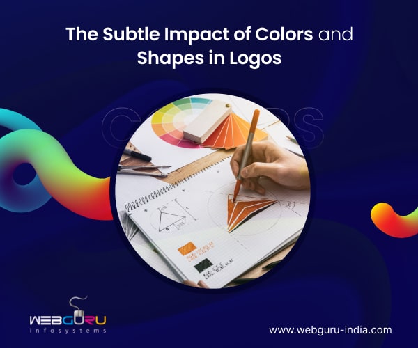
Colour Psychology in Logo Design
One of the most potent components of logo design is colour. It has the ability to elicit strong feelings, transmit messages, and change people’s behaviour. As different colours elicit different psychological reactions, astute designers take advantage of this fact to craft logos that appeal to their target market.
First, let’s talk about the colour red, which is frequently connected to passion, vigour, and excitement. Red is a vibrant, dynamic colour that is used in logos by companies like YouTube and Coca-Cola to compel viewers to act. Conversely, blue conveys a feeling of professionalism, dependability, and trustworthiness. Blue is used in the logos of tech behemoths like Facebook and IBM to imply competence and stability, giving their audience confidence.
Read our blog, Create an Impactful Logo Following the Neuro Design Principles that tell which artistic elements in a logo impact the subconscious mind.
Another interesting colour option is yellow. It stands for creativity, warmth, and optimism. Companies including McDonald’s and IKEA use yellow in their logos to evoke positive emotions and creativity, which increases consumer interest in their goods and services.
Green is frequently used by brands in the eco-friendly and wellness sectors because it is typically connected to nature, growth, and health. Green is a popular colour for logos used by businesses like Whole Foods and Starbucks to represent freshness, sustainability, and wellbeing and draw in eco-aware customers.
The psychology of colour encompasses not only single colours but also contrasts and combinations of colours. Analogous colours, like various shades of blue or green, imply harmony and coherence, while complementary colours, like red and green or blue and orange, produce a striking visual impact. By having a solid understanding of colour theory, designers can create logos that subconsciously appeal to their target market and shape their attitudes and actions.
Shape Psychology in Logo Design
A logo’s forms and symbols, in addition to colour, are very important in influencing how a customer perceives it. Shapes also carry psychological connotations of their own, each evoking unique feelings and meanings. Colours also have psychological connotations.
Think about the circle, a form that is frequently connected to harmony, wholeness, and unity. Circles are incorporated into logos by companies like Target and BMW to represent inclusivity, perfection, and continuity, appealing to consumers’ need for harmony and connection.
Conversely, squares and rectangles stand for dependability, stability, and order. Companies such as Microsoft and Adobe use these shapes in their logos to project a sense of reliability, professionalism, and solidity, thereby establishing themselves as leaders in their respective industries with a solid base.
Triangles represent aspiration, advancement, and growth because of their dynamic and upward-pointing orientation. It’s a shape that is also used in logos by companies like Adidas and Delta to inspire consumers to push boundaries and achieve new heights by conjuring up ideas of innovation, movement, and aspiration.
Customers’ perceptions of a brand’s personality and values can also be influenced by the shapes and symbols used in its logo. Geometric shapes communicate efficiency, structure, and precision; organic, flowing shapes evoke creativity, flexibility, and authenticity. Designers can produce a unified visual identity that subtly appeals to consumers by coordinating the shape of a logo with the brand’s identity and message.
Final Thoughts
To sum up, companies can use the psychology of colour and shape to their advantage to create a logo that will engage their audience more deeply. Through an awareness of the psychological connotations associated with various hues and forms, designers are able to produce logos that elicit particular feelings, transmit significant messages, and impact consumer behaviour. A logo can be transformed from a simple symbol into a potent brand asset that connects with customers and makes an impression by strategically utilising colour and shape psychology. This can be achieved by utilising warm hues to evoke feelings of passion and excitement or by incorporating geometric shapes to convey stability and reliability.
Brands can effectively communicate their personality, values, and message to their target audience by utilising the psychology of colour and shape in logo design. This creates strong emotional connections that encourage brand loyalty. That’s why businesses look for a logo design company in India so that they can draw their audience’s attention towards their products and services. With so many options and distractions available to consumers in today’s competitive market, a well-designed logo that subconsciously connects with them can make all the difference in grabbing their attention, establishing credibility, and propelling success.
3 comments
Leave a Reply

-
1000+
Happy
Clients -
25+
Countries
Served -
20+
Years of
Trust
I need help with...


The Subconscious Influence Of Colors And Shapes In Logos” is a fascinating exploration into the powerful impact of design elements on our perceptions and emotions. It sheds light on how subtle choices in colors and shapes can subconsciously shape our impressions of brands and products. This article serves as a reminder of the intricate thought and strategy behind logo design, highlighting the importance of visual cues in conveying messages and establishing connections with audiences. A thought-provoking read that underscores the significance of every detail in the world of branding and marketing
Really enjoyed this blog article.Really looking forward to read more. Will read on…
This is a fascinating exploration of color and shape psychology in logo design! I never realized how much these elements could influence our subconscious perception of a brand.
The breakdown of different colors and their meanings is super helpful – red for excitement, blue for trust, etc. And the part about shapes is interesting too – circles for harmony, squares for stability.
This blog definitely makes me think twice about the logos I see every day. Thanks for sharing!