Home Blog Website Design Services Taking a Reverse Approach to Design with Mobile-first Strategy
Taking a Reverse Approach to Design with Mobile-first Strategy
- 05 Dec / 2016
- 4,820 views
If you are of the opinion that mobile is the future, you are living under a rock. This notion was valid until about, say, 8 years ago; the world has moved on quite a bit in the past few years when it comes to internet usage and web interactions. Looking at a few statistics, we can see that there are more than 4.5 billion mobile web users around the world with about 47.3% of all web traffic in the US coming from mobile devices. With this kind of mobile usage, it would be more justified to say mobile is not the future, but the present. And such insane levels of mobile interaction inherently calls for a paradigm shift in design strategy. Responsive design, although still prevalent, is gradually becoming a thing of the past and “mobile-first design” strategy is taking over.
Why Choose a Mobile-First Strategy
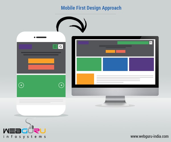
As the name suggests, “mobile-first” means designing for mobile first and gradually magnifying the web elements with respect to the desktop. It is opposite to responsive design, where the focus primarily rests on the desktop, and websites are regressively adapted for tablets and mobile devices. The approach is quite different here, not just in terms of the workflow but the use and presentation of different web elements as well.
Content is the Primary Center of Attraction
When designing with a mobile-first strategy in mind, it is the content that takes the steering wheel. All the clutter with the buttons, imagery, animations, etc. take a back seat, thus stripping down the website to the bare essentials. In return, the user gets a much cleaner and sophisticated look and feel of the website with faster loading times and an improved overall browsing experience.
The content is the top priority here and it should be extremely engaging for the users. Some are of the opinion that long form content is not suitable for mobile viewing, which is not true at all. People like to read on the go and it would be biased to state that you should only use short forms of content in a mobile-first design strategy. Studies have, in fact, suggested that people enjoy reading more on their mobile phones than on their desktop screens.
One advantage, here, is that the design is centered around the content, instead of having to adapt a pre-existing design to a long form content. Moreover, some people believe that different devices require different content structures and sizes, which is partially true. The best way to settle is to create context-specific content, meaning the content can be of any size or structure based on what it is about.
Why Progressive Enhancement Trumps Graceful Degradation
On one hand, there is graceful degradation, which implies building for the bigger screen and thereafter cutting it down for smaller devices. On the other, there is a progressive enhancement, which refers to designing a website in its simple and minimal form and gradually building on it with more advanced elements. While it might seem that both the processes are strikingly similar in terms of the end purpose, they have vast differences in reality.
In the case of graceful degradation, you start building for a desktop and the capabilities associated with it. This includes a full-fledged development process with all the functionalities of a desktop, which might not even be possible in case of a mobile device. When a design is created with respect to a desktop, the designer has a lot of room to play around with the elements. This space gets limited when the same design perspective is shifted to a mobile device. As a result, a lot of the elements which would perhaps make the website stand out, get eliminated on the mobile version and the website loses its charm completely.
On the contrary, progressive enhancement starts with the bare minimum for the small screens, where the designer can use only the content and the minimal design elements to provide the user with a smooth and clean user experience. When moving up to a bigger screen, the more attractive features such as animations and motion graphics can be displayed perfectly. Hence the design does not get compromised in any way and the website looks equally good on both the devices. And any designer would easily agree that it is easier to add more than to cut down on what is already present.
With graceful degradation, there is a chance that after cutting down on design and features, the end product might not look as appealing on mobile as on desktop. It often tends to be half-baked or even non-functional. But when enhancing progressively, it is easier to focus on the mobile experience and provide the very best of what the small screen can offer. If anything additional has to be added to this already attractive experience, that can be easily done by then focusing on the potential of desktop computers. It would, therefore, be quite normal to say that progressive enhancement is a much better choice than graceful degradation, which often does not turn out to be as graceful as it should be.
Is Mobile-first Design the Best Strategy to Follow?
Like every other technological enhancement, the mobile-first design scheme does come with inevitable hurdles. Responsive design is the way to go in today’s world. And it is essentially built to go hand in hand with a mobile-first strategy. But here the constraints are far more pronounced. First, the screen size is a big issue with most designers. After years of playing around with the real estate of a big screen, they now have to deal with a diminished screen size and it can be frustrating. The scope for variety is also limited. But what the designers fail to fathom is that a mobile-first approach is not about the design and the aesthetics, but instead focuses on the end user experience. With more and more people using their smartphones to browse the web, it can be a huge step forward if this strategy is applied. If looked at from a strict designer’s point of view, this might not be the best strategy to follow, but that is just a matter of time, practice and adoption. It is never about the designer or what he is comfortable working with. It has never been. Anything they do is for the end user and the success of the mobile-first strategy lies exclusively in the fact that ‘their’ mobile experience is not hampered. After all, as Steve Jobs has famously said – “Design is not how it looks like and feels like. Design is how it works.”
Looking for mobile-first design for your business website? We can help. Contact us today!

7 comments
Leave a Reply

-
1000+
Happy
Clients -
25+
Countries
Served -
20+
Years of
Trust
I need help with...


I certainly agree with what you have said here. Mobile-first design strategy focuses less on the design elements but more on the end user experience. It might not be the best choice for designers, but then again, the design is all about how it works.
I am also agree with you although the mobile design is responsive but its totally depend upon the end user because the whatever design should be its upon users that how they are using it. whether they are founding difficult to use or not.
This Mobile-first design strategy is a nice idea to implement, but yes ultimately user’s choice means a lot,that what design they want and how they are using it.
Thanks for sharing such an informative stuff. I hope it will be useful. Keep posting.
That’s great i use for my web. Thank so much!
Thanks for sharing Information…
Nice Blog..Keep it up.