Home Blog Graphic Design Services Popular Logo Design Trends to Find Greater Appeal in 2016
Popular Logo Design Trends to Find Greater Appeal in 2016
- 27 Apr / 2016
- 6,916 views
As brands are becoming aware of the significance of visual branding, logo designers strive to come up with unique logo design trends that help in channelling the right brand message to prospective customers. Like the past few years, 2016 also has its own share of trends in ever-evolving logo design arena. As an inherent part of designing industry, logo design services plays crucial role in empowering a company’s brand identity. The following trends are all set to swamp up the eCommerce market this year:
– ‘Simplicity’ is the key: Gone are those days, when designers were inclined to swap between gradient colours, gloss, shadow effects and 3D effect for designing logos. Today, simplicity has turned synonymous with sophistication. Over the years, logo-design trends have evolved much; and in maximum cases, this evolution has been predominated by the ‘trend of simplicity’.
![]()
![]()
For an example, take a look at the evolution of Google’s logo. To identify the change, take your flight back to its emblem designed back in the early 20’s. Back then, a bit colour-jumbling was discernible in the Google’s logo. This design flaunted four loud colours including Green, Red, Yellow and Blue. The design was short-lived.
Next, the effects of ‘drop shadow’ were added to the logo for incorporating dimensionality to it. It went through changes again. This time, the logo design was decided to keep free of overt connotation to embrace simplicity.
Finally, in 2015, the newest version of Google’s logo reared its head; and showcased uncluttered look, simple Serif Font and Flat design. This time, both the texture and shading of every letter is done in a subtle way in order to add lightness and style to it. It’s simple but yet there’s always an ethereal quality to it.
– Flat colour is here to stay: Not all the tricks in a designer’s palette have to be over-the-top; and colours are no exception either! Brightly hued logos are history. Logos painted in flat colours is designer’s new fascination. The colour dial has gotten certainly pegged to make logos go easy-on-eyes. The trend is discernible in the evolution of Apple’s iconic logo.
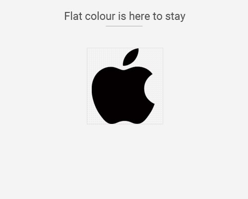
Mr. Steve Jobs has always considered simplicity as being stylish. The latest logo of Apple is born out of this theory. The very first Apple logo was created in 1976. It featured the famous scene of how Sir. Isaac Newton invented the ‘law of Gravity’- sitting beneath an apple tree.
This logo did not survive long; and switched to one of a shape of a slightly-eaten apple with colourful rainbow stripes. Consisted of six bright shades, the rainbow-themed Apple logo looked bold and bright. Nevertheless, it was decided to try out a bit more experimentation again. Resultantly, it was further simplified into a silhouetted apple image consisting only black colour. Finally in 2000, the logo was replaced with a Monochrome apple. Big thumbs up to its uncluttered and classy appearance!
– 3D effect is losing ground: No denying to it- this is an era of simple and flat logo design trend. Eliminating 3D effects from logos has turned one of the hallmarks of this trend. The logo design industry experienced a sudden jolt when 3D effects started gaining grounds. 3D effects became popular in creating an out-of-the-box showcase of logo icons. Today, these once popular 3D effects, no longer define the level of attractiveness of a logo. Let’s have a cue from the evolution of Microsoft’s iconic logo:
![]()
![]()
The introduction to 3D effects in the Microsoft logo came with the release of Windows XP. As told already, this version gained a sense of three-dimensional effects from the rich gradients and shadows. Switching to 3D effect was certainly a major shift for Microsoft logo design. Despite its aesthetic brilliance, this logo featuring glossy-3D effects failed to survive in the long run.
The final version of Microsoft Logo was unveiled in 2012, featuring a multicoloured Windows symbol. Presence of four conventional Windows colours including red, green, blue and yellow is the major attribute of this current emblem. Surprisingly, the 3D effect featured by the previous Microsoft logo, was discernibly removed from the latest one. The new logo is simple, colourful, flat and most importantly catchy to eyes.
– Minimalism: “Minimal art went nowhere”- yes, the art of minimalism will continue to hold the ground, even in this 2016.
![]()
![]()
The principles of minimalistic design aim to create logo without complicating it with gloss, 3D effects, gradient colours, shadow effects, striking shades etc. Inclusion of flat shades, limited colour schemes, simple typography, straightforward wording, negative space and a few UI elements have always come up with rewarding results.
Popular brands like Nike, Canon, Adidas, Nokia, HP and Reebok etc. have formed their logos depending on this minimalistic ritual. Kudos to this minimal yet creative approach! It has turned these logos easily identifiable, almost iconic. These logos are and will always be great communicators to communicating the brands’ personality.
Logo design trends come and go. Every trend précised above already exist in the design industry, and the future seems to be bright for each of them. The experts would preferably follow these up-and-dated principles of logo designs to create more evocative logos in 2016.
Related Article – How Logo Design Services Can Help You In Brand Building?

6 comments
Leave a Reply

-
1000+
Happy
Clients -
25+
Countries
Served -
20+
Years of
Trust
I need help with...


such an useful and effective post, thank you for sharing
Best website designing services provider companies help their client to grow their business creating and developing unique designs. Thanks for sharing such an informative blog post.
Logo design trends keep changing every now and then. More and more polished designs are coming to the forefront and companies are investing millions in making creative logos. This is a very well-written blog which can help designers understand the latest trends and design accordingly.
Nice article. I like it. I know a good logo is very important to become a brand identity.
I read your post. this is good post..
Thanks for sharing such a useful and effective post.