Home Blog Category: Website Design Services

The Need of a Website for Small Businesses
In today’s world, people turn to Google for the smallest of requirements. A single search query can generate a list of innumerable websites. So if
- 23 Nov / 2016
- 6,850 views

Responsive Website Design and Accessibility – Are They Related?
Websites serve as a viable source of information in today’s world. Imagine a world where you visit a website but do not get the information
- 07 Nov / 2016
- 5,177 views

An Overview of Bootstrap Framework
The Web nowadays, is not something that can only be seen on desktops, rather we now carry it in our pockets. This is now a
- 19 May / 2016
- 7,908 views
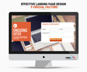
Effective Landing Page Design – 5 Crucial Factors
A landing page is also termed as “lead capture page” in the extensive arena of internet marketing as it helps capture a new lead or
- 18 Mar / 2016
- 4,295 views
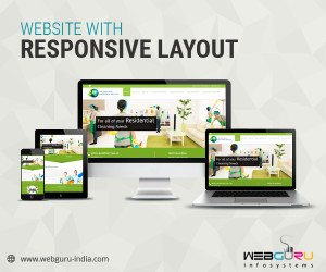
Reasons Why Your Business Requires Website with Responsive Layouts
Every business requires a website for ensuring its progress and resultant success. But, today it is not just about looking good on the monitor of
- 03 Feb / 2016
- 4,342 views

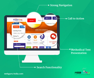
The Importance of Search Functionality in Website Design
Easily navigable pages, seamless user experience on cross devices, engaging and informative content, stunning visuals – these are some of the must-haves for a successful
- 14 Jan / 2016
- 36,672 views

The Importance of White Space in Website Design
In terms of website design, whitespace is the space left between graphics, texts, columns, margins and those components that make up a design. It is
- 09 Jan / 2016
- 23,006 views
Website Design – The User’s Perspective
The success of any tangible or intangible product is defined by its utility and usability. Likewise, it is for custom website design services as well.
- 16 Dec / 2015
- 6,135 views
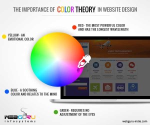
The Importance of Color Theory in Website Design
A website describes your business personality. It symbolizes your business. There is more to website design in addition to text and images – color. Colors
- 27 Nov / 2015
- 10,455 views

How to Optimize Your Homepage Design
Online users today are more impatient and unforgiving than ever before. Failing at making a lasting first impression through your website homepage will lose you
- 20 Nov / 2015
- 11,713 views

-
1000+
Happy
Clients -
25+
Countries
Served -
20+
Years of
Trust
I need help with...


