Home Blog Graphic Design Services 12 Modern Logo Design Trends for 2023
12 Modern Logo Design Trends for 2023
- 13 Jan / 2023
- 5,559 views
- 7 Min Read
Logo Design is a field that’s constantly in a state of evolution. Trends that are showing up today may disappear into the wind tomorrow. At the same time, some trends (like minimalism) may turn out to be timeless and stay popular even several years down the line.
A great logo is one that people can easily identify anywhere and everywhere, and get reminded immediately of your brand and their experiences with it. This is a big ask, and incorporating popular trends into a brand-new logo is a challenge to logo design services everywhere. However, there’s inspiration all around us as new trends keep arising.
Logo Design Trends in 2023
Overall, the trends in logo design in 2023 are likely to be characterized by a balance between simplicity and creativity. Companies will try to make an impact with logos that stand out and are easy to recognize. Here are the logo design trends that you should keep a watch out for in 2023.
1. Bold & Vibrant Colors
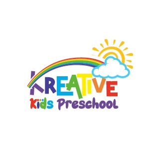
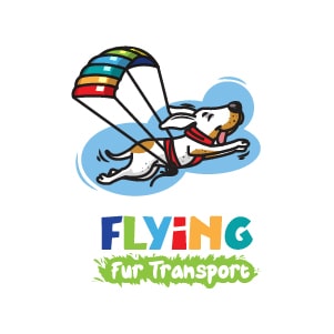
Logo design has been trending away from the use of muted tones and instead towards a more vibrant, bold color palette. This trend is based on a number of reasons, including the fact that people are much more likely to remember colors that are in high contrast with their surroundings.
Some say that it’s because digital devices now allow for much louder and higher-contrast designs than ever before. Brightening up a logo can make it easier to read on screens of all sizes, from small phones to large monitors. It also makes the brand more visible in bright sunlight or on brightly colored backgrounds. Marketing research has also shown time and time again that colorful logos are associated with positive brand associations (such as being innovative or fashionable).
You may check out this infographic to know more about how to use colors in logo design.
2. Negative Space
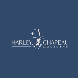

Negative space is a trend that is seeing increasing use in logo design. It refers to the spaces around a letter, figure, or other graphic elements that have been intentionally left empty to create an overall effect of balance and harmony.
The power of negative space can be seen in both small and large logos. In smaller logos, it can help to create a sense of intimacy by emphasizing the elements within the design. In larger logos, negative space can provide stability and strength by creating an illusion of depth. The logo of WWF is a great example.
There are many different ways to use negative space effectively in your logo designs. Try experimenting with different depths and textures until you find something that works best for your particular project (and aesthetic). You may also want to consider using light instead of dark colors throughout your logo layout for added contrast and visual interest.
3. Glitch Effects
Glitch effects are a popular trend in logo design these days, and for good reason. They can add an extra level of sophistication and dimension to a design, making it look more futuristic and creative. Plus, they’re easy (and fun) to incorporate into your designs without having to spend hours trying to create them from scratch. TikTok’s current logo is a very identifiable example of this trend.
Glitch Effects work best when they are subtle – avoid overdoing them or the effect will become too noticeable rather than enhancing the overall look of your logo. Use blends and textures wherever possible to create depth and complexity within the graphic elements of your logo. Add glints, sparkles, static displays, wobbles – anything that makes your design feel alive and dynamic.
4. Gradients

The use of color gradients in logo design isn’t exactly a new trend. However, it isn’t a trend that is expected to go away any time soon. Think of Instagram’s current logo, and how instantly identifiable it is.
This trend is especially noticeable when it comes to fonts, as gradients are often used to give a typeface a softer or warmer look. There are many reasons why color gradients can be effective in logos – from adding depth and dimension to designs, to creating a sense of unity and symmetry.
So, how do you go about using color gradients in your logo design? The simplest way is usually by starting with an existing logo and applying the gradual changes gradually over time (or using presets). You can also experiment with different colors and shades within the same gradient, or mix various gradients together for an even more intricate effect.
5. Geometric Patterns
Geometric shapes and patterns are becoming increasingly popular in logo design. They can help to create a striking, unique look that is sure to catch attention. Some of the most common geometric shapes used in logos include circles, triangles, squares, and rectangles. These shapes are often combined with simple but effective color schemes to create eye-catching designs. Think of the current logos of Adobe and Mitsubishi, for example.
There are many benefits to using geometric designs in your branding strategy. First of all, they tend to be visually appealing and easy on the eyes. Second, they can communicate simplicity and strength simultaneously – two important qualities for any brand’s logo design portfolio. And last but not least, geometric logos are highly resistant to visual fatigue – which is great news for businesses that want their logo to stand out from the competition.
6. Monograms
Monograms are quickly becoming a popular way to add personality and design flare to your logo. They’re also an excellent way to tie in the company’s mission or values with its branding. Plus, monograms can be used as a unique identifier for your brand online and off.
There are several reasons why monograms make sense as part of a logo design strategy. For one, they impart both visual appeal and staying power when displayed on products or websites. Monogram designs also tend to be more memorable than standard logos – which is important if you want people to remember your brand easily even after only seeing it once. Plus, they can act as icons that help shoppers differentiate between similar brands while searching online or through catalogs or store shelves.
7. Disappearing Text or Objects

Vanishing text and objects are becoming increasingly popular in logo design. This trend is based on the idea that by using disappearing texts or objects, companies can create a more mysterious and attractive brand image. It can be used to create a sense of depth, or to emphasize certain elements of the logo.
It can help to attract new customers by creating an aura of mystery around your brand. It also makes your logo look more dynamic and modern, which appeals to consumers who want their logos to reflect current trends. It can also be effectively animated into a GIF for your website or app, with the vanishing effect becoming more prominent.
8. Minimalism and Minimalist Symbolism
Minimalism is an aesthetic movement that emphasizes the use of simple, uncluttered designs. It first emerged in the early 1990s as a reaction to over-the-top branding and excessive ornamentation in contemporary design. Minimalist symbolism draws on basic geometric shapes and colors to create minimalist logos that are easy to identify and remember. Think of the current logos of Papa John’s, BBC, or Apple. The idea is to establish a brand identity powerful enough to convey all the necessary information through very little visual stimulation.
Minimalism is sleek, modern, and appeals to a wide range of people. Plus, it can be incredibly effective when used correctly in logos. Here are six tips on how to use minimalism effectively in your logo designs:
- Use simple shapes and basic colors that are easy to understand. This will help make your logo look more professional and polished.
- Choose a font that is legible but not too flashy or attention-grabbing. Stick with classic fonts like Helvetica or Arial instead of trendy options like Comic Sans or Impact Cyrillic
Read more: Gestalt Theory in Logo Design
9. Layering
Layering is a popular trend in logo design, and it’s becoming more and more popular all the time. It’s simply using different layers of colors or textures to create a complex visual effect. Layers can be used to create depth, add emphasis to certain elements, or just make your logo look visually interesting.
- It gives logos a more intricate and detailed look. By using multiple layers of color, you can create an image that is difficult to reproduce with just one color alone. This makes your brand seem high-quality and sophisticated.
- It creates contrast. Different colors together often result in a brighter overall image – which helps draw attention to your logo.
10. Abstract and Creative Typography
Typography can be used in a number of ways to create an eye-catching logo. Some designers prefer to use weird, abstract, and colorful typography in their logos simply for the fun of it. Others believe that this type of typography can help to set their brand apart from the competition.
Different typography can add personality and excitement to a logo design, making it more immersive and engaging. Objects and wavy lines interspersed into text can really make it stand apart. Abstract typefaces tend to be less legible than traditional typefaces, which can make the logo harder to read. On the other hand, brightly colored fonts can inject some life into a drab or boring logo.
11. Hand-drawn Elements
Hand-drawn elements can add a sense of personality and uniqueness to a logo design. These elements can be created using traditional drawing tools like pen and paper, or digitally using a graphics tablet. Unlike vector-based graphics, which are precise and geometric, hand-drawn elements have an organic, imperfect quality that can give a logo a more human touch.
While digital design tools have made it easier to create professional-looking graphics, there is still a place for the imperfection and personality of hand-drawn elements. These elements can help a logo stand out and differentiate a brand from its competitors. In 2023, we may see more logos incorporating hand-drawn elements as a way to add a touch of personality and authenticity.
12. Retro & Vintage
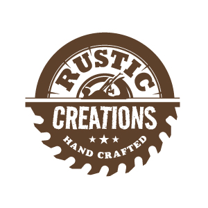
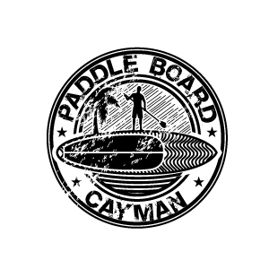
Retro and vintage designs can bring a sense of nostalgia and history to a brand. These designs often draw inspiration from past decades or styles, and can include elements such as retro fonts, vintage color schemes, or design elements from a specific era.
While many companies opt for modern, sleek logos, there is still a place for retro and vintage designs. These designs can be particularly effective for companies that want to evoke a sense of tradition or heritage, or for those that want to differentiate themselves from more modern competitors. In 2023, we may see more logos drawing inspiration from the past as a way to tap into these emotions and associations.
It’s important to note, however, that retro and vintage designs can also feel dated or out of touch if they are not used appropriately. It’s important for companies to consider their target audience and brand image when deciding whether a retro or vintage design is right for them.
Read also: Using Neuro design to Create Impactful Logos
Conclusion
From negative spaces to gradients to bold solid colors, the possibilities are endless. There are several fascinating trends to explore when it comes to making a logo for your company. In 2023, designers will likely try to employ graphical elements and modern fonts in order to find the most efficient and winning solutions.

Shrutarshi Das
Shrutarshi Das is a purveyor of all things digital, with a particular interest in new technological innovations, photography, and gaming.
7 comments
Leave a Reply

-
1000+
Happy
Clients -
25+
Countries
Served -
20+
Years of
Trust







If you want to make an impact with logos that stand out and are easy to recognize, then you should definitely read this blog. It highlights some of the most popular logo design trends.
Brands’ logos are evolving with businesses using them to consolidate their presence in the market and create recall. The 12 logo design trends for 2023 are interesting to read and can help businesses carve out a unique space in the market.
You made some good points there. I looked on the internet for the subject matter and found most guys will consent with your blog.
Your choosing’s are wonderful, Thanks for sharing this article with us. keep posting.
Embarking on a design-forward journey! This blogpost on the ’12 Modern Logo Design Trends for 2023′ is a compass for anyone navigating the evolving landscape of visual identity. From minimalism to maximalism, it expertly dissects the trends shaping the future of logo design. Whether you’re a designer seeking inspiration or a business owner aiming for a contemporary edge, this insightful read is your roadmap to staying on the pulse of design aesthetics in the coming year. Don’t miss the chance to elevate your brand with these cutting-edge insights!
“Exploring the ever-evolving world of logo design 🎨🖌️. 2023 brings a blend of bold colors, minimalist symbols, hand-drawn elements, and retro vibes. Keeping up with these trends ensures your brand stays fresh and memorable. #LogoDesignTrends2023 #Branding”
Awesome post. Thanks for posting.