Home Blog Category: Website Design Services

Web Design 3.0 – A Complete Overview
Web design trends are constantly changing and you can observe immense change between the website designs of 2000 and of today. This change, however, is
- 17 May / 2021
- 4,913 views

How Much Does it Cost to Build a Website – 2021 Updated
Having a website is of paramount importance for any business of any size. Modern consumers prefer to learn all about a business with a tap
- 23 Jan / 2021
- 3,756 views

Why Start-ups Need Professional Website Design Services?
As the name suggests, start-ups are enterprises that are looking to establish their place in the competitive world of business. So, the foremost thing they
- 12 Nov / 2019
- 4,949 views
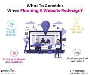
What To Consider When Planning A Website Redesign?
Is your website not generating enough leads? Do you feel that your current website stands outdated when compared to the evolving goals and strategies of
- 07 Nov / 2019
- 4,623 views

What Is The Cost For Website Design In India?
For a business owner looking to hire a website development company in India, nothing can be more confusing than the multiple pricing variations and numerous
- 06 Sep / 2019
- 9,629 views

The Key Role of Animation in Website Design
Website designs have changed with time thanks to the advent of new design trends and shifting customer preferences. Today, the purpose of having a website
- 24 Jul / 2019
- 9,605 views

The Benefits Of A Materialize Responsive Framework
The growing competitiveness of the digital medium has made user experience (UX) the principal differentiator for websites and web/mobile applications to garner leads and drive
- 29 Jun / 2019
- 7,386 views

An Ebook On Website Design And Development From Webguru Infosystems
Websites represent the dynamic nature of online business. In order to increase the user traffic to your website, it should be aesthetically designed and embody
- 21 Feb / 2019
- 6,145 views
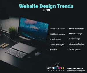
What Are The Top Web Design Trends of 2019?
The relentless growth of digitization is here to stay and the year 2019 will not be too different. The year is expected to witness a
- 02 Feb / 2019
- 15,324 views

How To Find A Balance Between SEO And Creative Website Design?
“In the world of internet customer service, it is important to remember your competitor is only one mouse click away.” – J.P.Morgan & Co. Do
- 30 Nov / 2018
- 10,355 views

-
1000+
Happy
Clients -
25+
Countries
Served -
20+
Years of
Trust
I need help with...


