Home Blog Category: Website Design Services

Optimizing Web Design for Foldable Screen Resolutions
In the rapidly evolving world of technology, the way we access the internet is constantly changing. With the introduction of foldable devices and smartphones with
- 01 Feb / 2023
- 5,162 views
- 7 Min Read

Figma – What Makes it Such a Popular Design Tool
In the middle of the crowd of new and advanced UI/UX design tools, one has managed to really stand out and get people’s attention –
- 23 Nov / 2022
- 1,170 views
- 5 Min Read
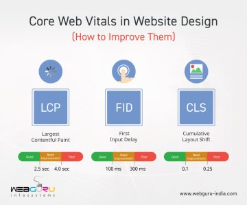
Core Web Vitals in Website Design (How to Improve Them)
Has your website ever dropped in SEO rankings and you were left wondering what went wrong? In such cases, after examining the core SEO factors
- 11 Nov / 2022
- 1,505 views
- 5 Min Read
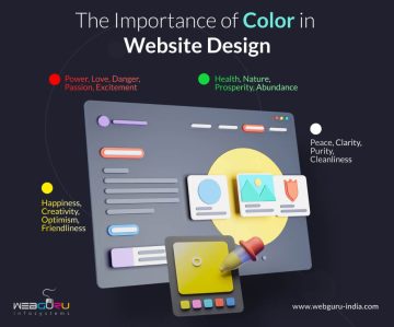
Using Color Strategically in Website Design
Color is a very powerful tool in website design. Attracting attention, expressing meaning, creating desire, directing conversation – all of this and more can be
- 28 Jun / 2022
- 2,063 views
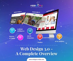
Web Design 3.0 – A Complete Overview
Web design trends are constantly changing and you can observe immense change between the website designs of 2000 and of today. This change, however, is
- 17 May / 2021
- 3,193 views

How Much Does it Cost to Build a Website – 2021 Updated
Having a website is of paramount importance for any business of any size. Modern consumers prefer to learn all about a business with a tap
- 23 Jan / 2021
- 2,519 views

Why Start-ups Need Professional Website Design Services?
As the name suggests, start-ups are enterprises that are looking to establish their place in the competitive world of business. So, the foremost thing they
- 12 Nov / 2019
- 3,814 views
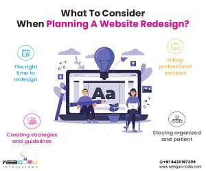
What To Consider When Planning A Website Redesign?
Is your website not generating enough leads? Do you feel that your current website stands outdated when compared to the evolving goals and strategies of
- 07 Nov / 2019
- 3,460 views

What Is The Cost For Website Design In India?
For a business owner looking to hire a website development company in India, nothing can be more confusing than the multiple pricing variations and numerous
- 06 Sep / 2019
- 8,242 views
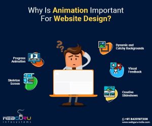
The Key Role of Animation in Website Design
Website designs have changed with time thanks to the advent of new design trends and shifting customer preferences. Today, the purpose of having a website
- 24 Jul / 2019
- 7,555 views

-
1000+
Happy
Clients -
25+
Countries
Served -
19+
Years of
Trust
I need help with...


