Home Blog Category: Graphic Design Services

Effective Brochure Design Strategies to Promote Your Business
Before getting to the main section, imagine a scenario: you attended a business meeting and discussed with others about your company, services, and products. And
- 10 Apr / 2020
- 6,092 views
How To Make A Logo For Your Company – Webguru Infosystems
Are you a start-up looking to get a head start in your business niche? The first thing you should consider is creating a strong brand
- 24 Dec / 2019
- 7,605 views
Social Media- A Game Changer in the World of Logo Design
Before the advent of the digital age, businesses used to design logos that went well with their business cards and letterheads. The logos allowed them
- 10 May / 2018
- 7,618 views
Reasons to Copyright a Newly Created Business Logo
Imagine spotting your own creative design on the billboards with some other name attached to it. Call it plagiarism or your folly, you just lost
- 05 Sep / 2016
- 4,629 views
Take a Look at Our Recent Logo Designs
Logo design is an art that needs a lot of research and experience to master. Over the years, we have honed our skills and improved
- 26 Aug / 2016
- 6,220 views
The 2016 Rio Olympics Logo – The Story Behind Its Creation
The stage is all set. The participants are ready. The palpitation shoots up as billions of people nestle at the edge of their seats, their
- 12 Aug / 2016
- 3,776 views
Popular Logo Design Trends to Find Greater Appeal in 2016
As brands are becoming aware of the significance of visual branding, logo designers strive to come up with unique logo design trends that help in
- 27 Apr / 2016
- 6,876 views
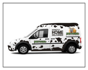
A Showcase of Our Latest Car Wrap Design with Custom Graphics
Car wraps are the most cost effective way to promote your ‘BRAND’. Unlike stationary signage like billboard or poster, your vehicle advertisement can be everywhere
- 13 Oct / 2015
- 4,900 views
5 Principles – How to Design a Great Logo
A good logo is simple, appropriate, distinctive, practical and graphic in form and conveys an intended message. The basic principles of logo design are easy
- 02 Jul / 2015
- 7,920 views

Why Corporate Identity Design is Vital for Your Business
What is your business’s brand identity? What does the identity say about your company? What impression are you reflecting to your clients and potential clients?
- 29 Jun / 2015
- 4,179 views

-
1000+
Happy
Clients -
25+
Countries
Served -
20+
Years of
Trust
I need help with...


